Designing Flow: Making Every Transaction Effortless
Created a frictionless way for users to send, request, and split payments without jumping screens

MY ROLE
Product Designer

TIMELINE
5+ months | 2 phases to launch

TEAM
2 Designers, 1 Product Managers, 4 Developers, 4 Data Analyst

PROBLEM
Users faced friction while performing financial actions, they had to return to the main page every time to switch between Send, Request, and Split transactions which created confusion, increased completion time, and disrupted the overall user flow.

OUTCOME
Redesigned SmartID’s Finance Flow into a unified, intuitive payment hub enabling users to send, request, and split payments within one screen, reducing completion time by 24% and enhancing clarity, trust, and confidence in every transaction.
-understanding “why” it needs fixing
WHERE USERS STRUGGLED

During early usability sessions, the same feedback surfaced again and again:
Instead of trust and simplicity, the experience felt fragmented.

Objective
Design a smooth and intuitive finance flow that lets users manage payments confidently, reducing friction and repetitive steps for a faster, more connected experience.

Challenge
Reimagine the finance experience as a single, connected flow one where users can send, request, and split payments without interruption by focusing on continuity, visibility, and instant feedback, the redesign had the opportunity to turn repetitive transactions into a seamless, confidence-building experience.
- discovering user truths
FINDING THE GAPS
When I presented SmartID’s early designs to investors, the reaction echoed what I had already seen in usability tests.
//userproblem01
“After every successful payment, I’m taken back to the main Finance page. It breaks my flow , I just want to continue from where I left off.”
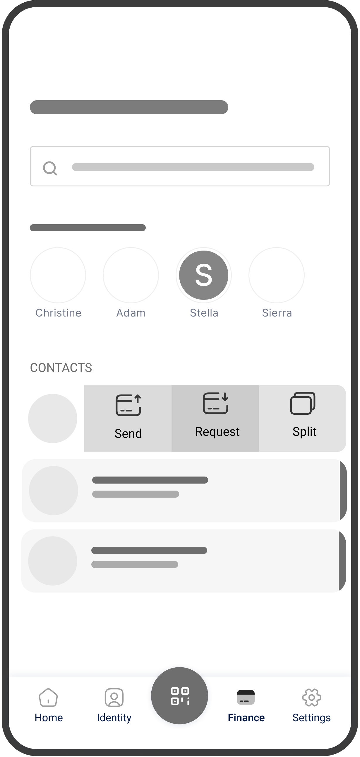
Old flow forcing users to return to Finance Home after each transaction
//userproblem02
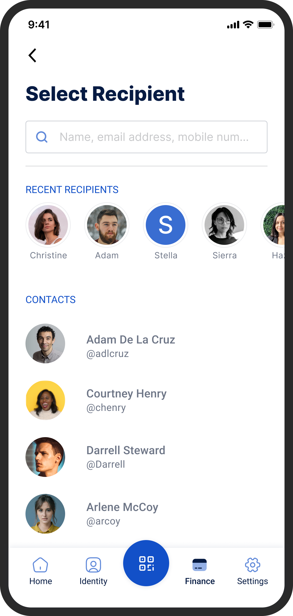
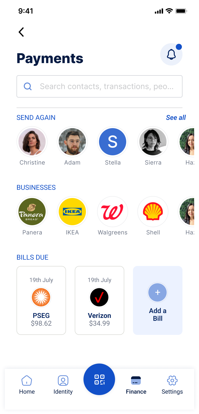
“There’s no quick way to resend money. I wish I could see my recent payments or contacts right at the top instead of searching again.”
Missing ‘Recent Payments’ section causing repetitive manual searches.
//userproblem03
“I land to same home page after each transaction, its frustrating to come back again to this page every time.”
Missing ‘Recent Payments’ section causing repetitive manual searches.
-identifying core problems
USER PAIN POINTS
Noted pain points and design gap

Too Many Steps
6+ clicks to complete a single payment to multiple payment.

Cognitive Overload
Constant back-and-forth made users second-guess every tap.

Fragmented Navigation
Each action lived in isolation, forcing context-switching.
Before: Design Flow
- BEFORE CHANGES METRICS •

15 Participants were interviewed
5 Tasks
30 minute session
Moderated testing
Heuristic evaluations
Mental modal
Surveys
Post-test questionnaires
64%
Task success
12.8s
Avg. time per task
59/100
User satisfaction score

Key Takeaways
Designing for flow, not just function reducing friction between actions built user trust and made financial interactions feel effortless.
-testing, wireframing, refining
REDESIGNING FOR SIMPLICITY
GOALS
Turned user concerns into design priorities

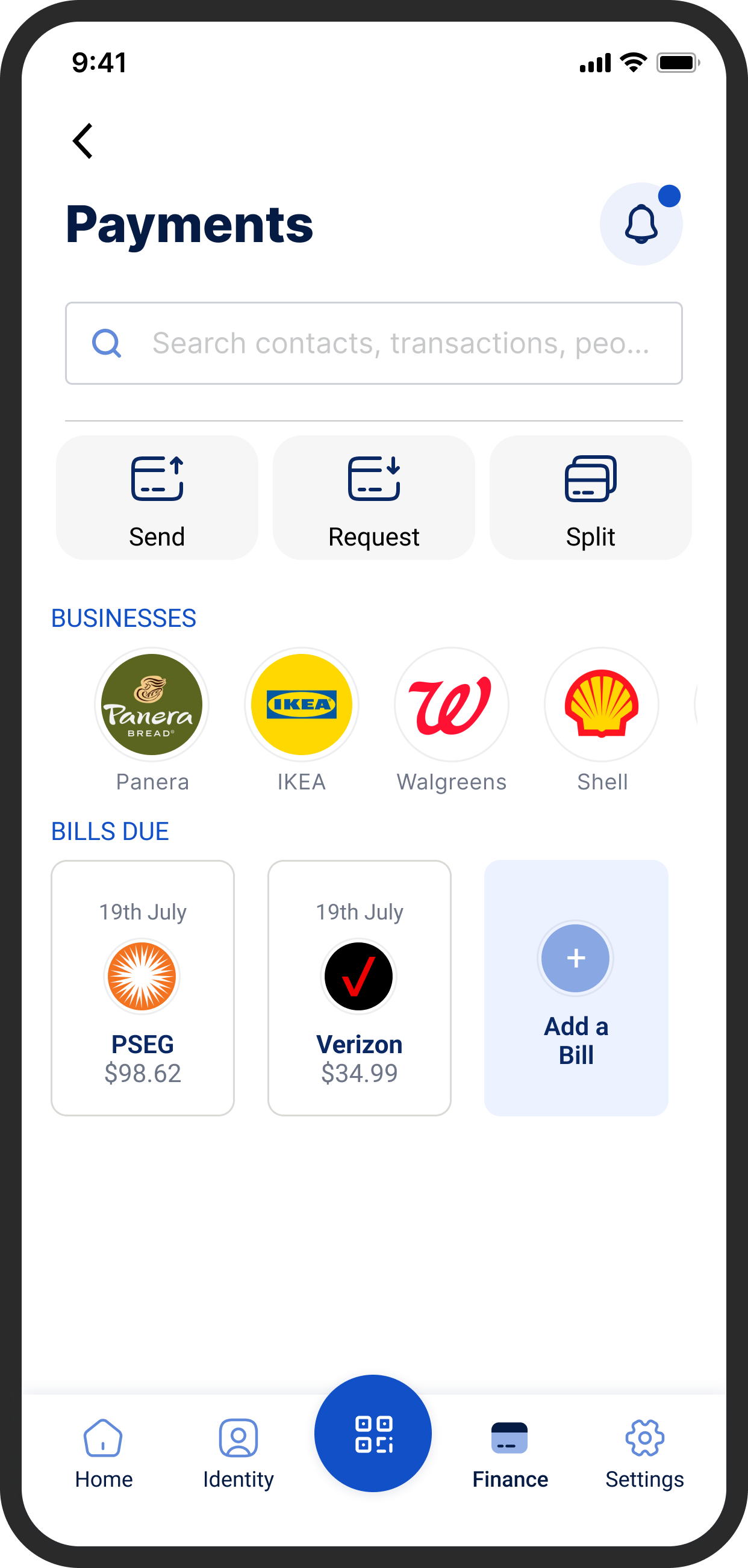
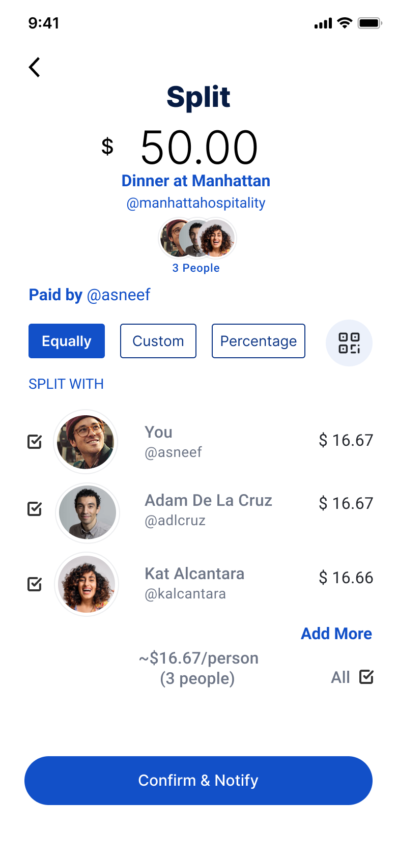
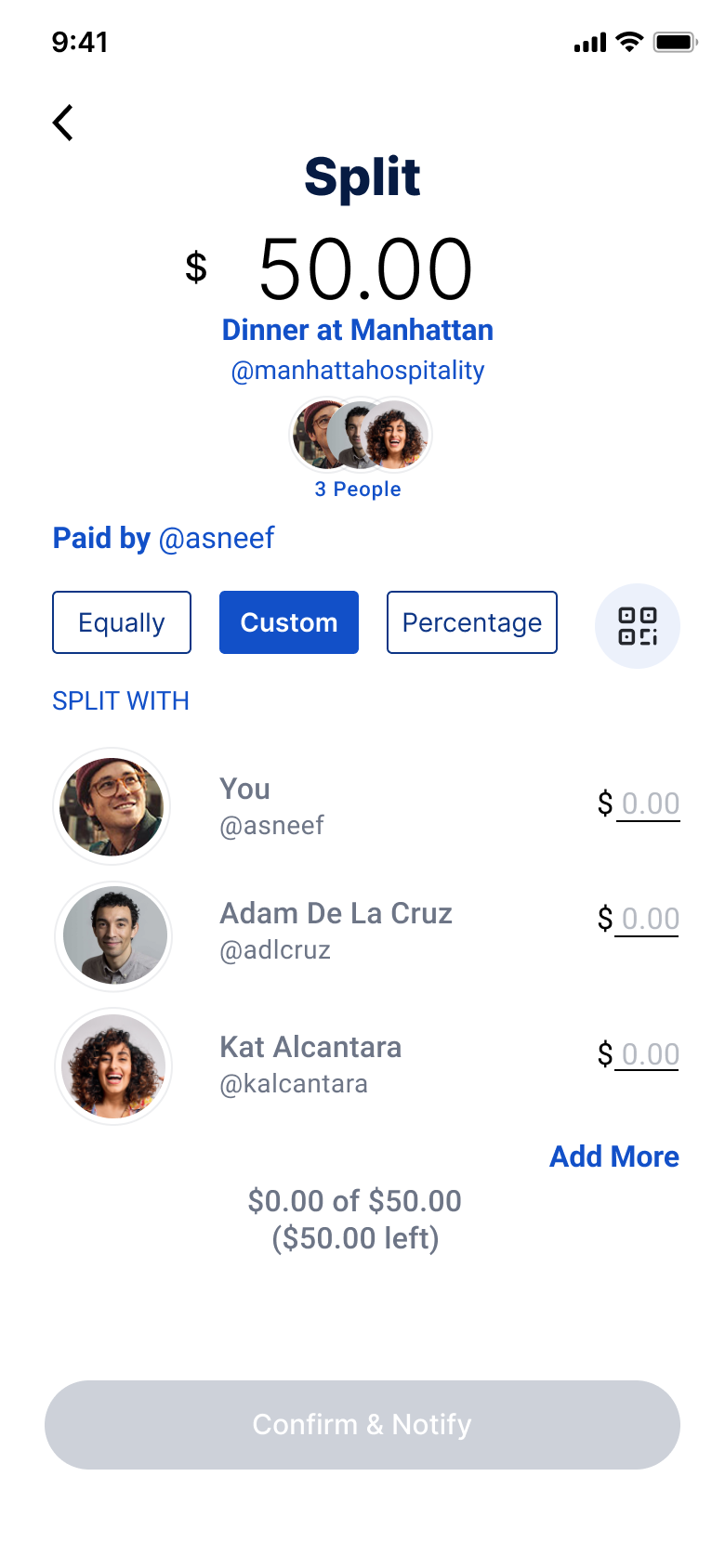
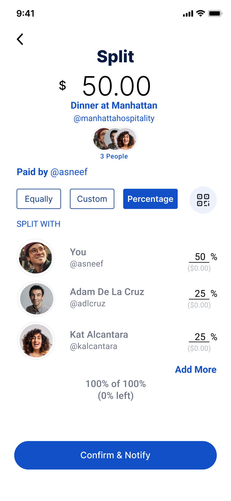
Smarter Payment Flow
Allow users to switch between Send, Request, and Split without leaving the screen.

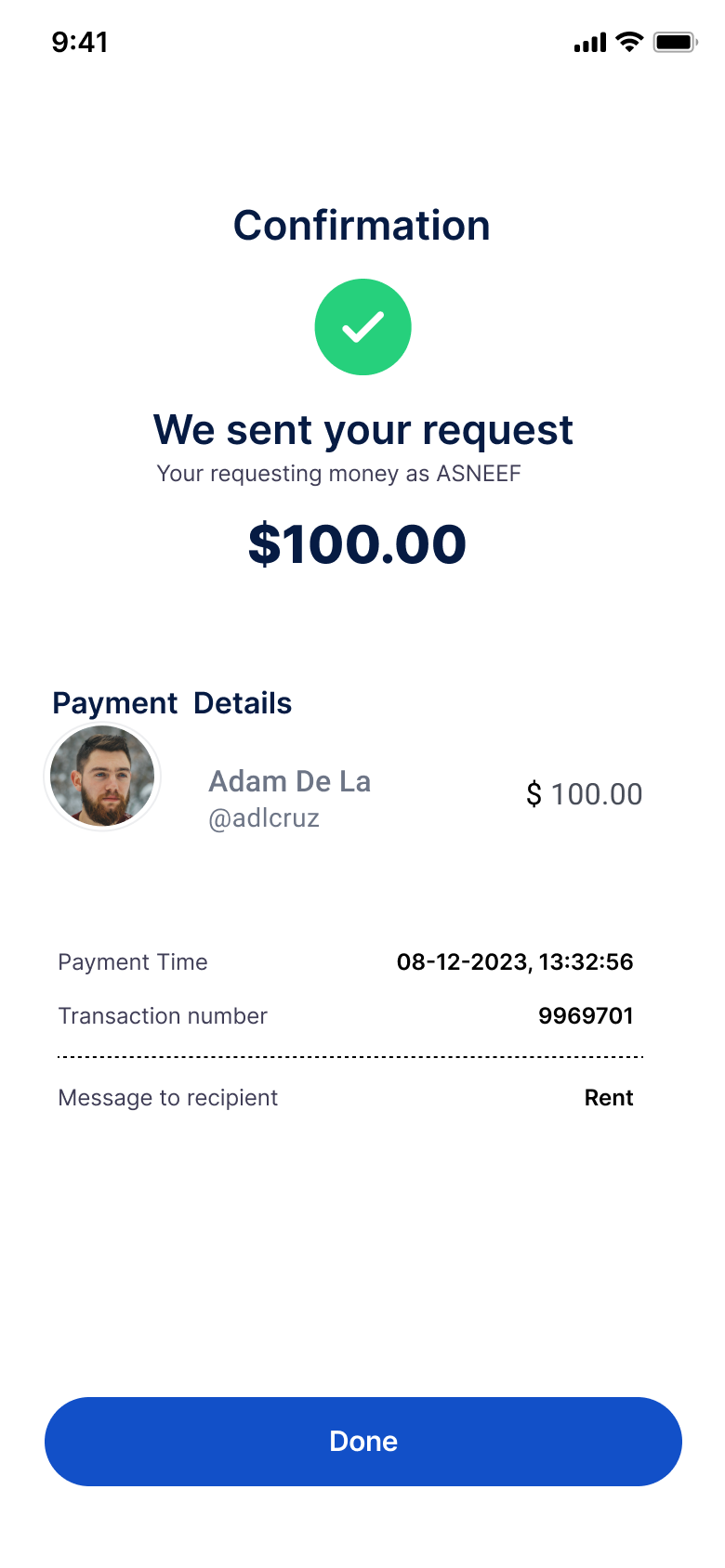
Inline Confirmation
Show success messages immediately after each action

Reduced Steps
Bring transactions down to under 5 clicks
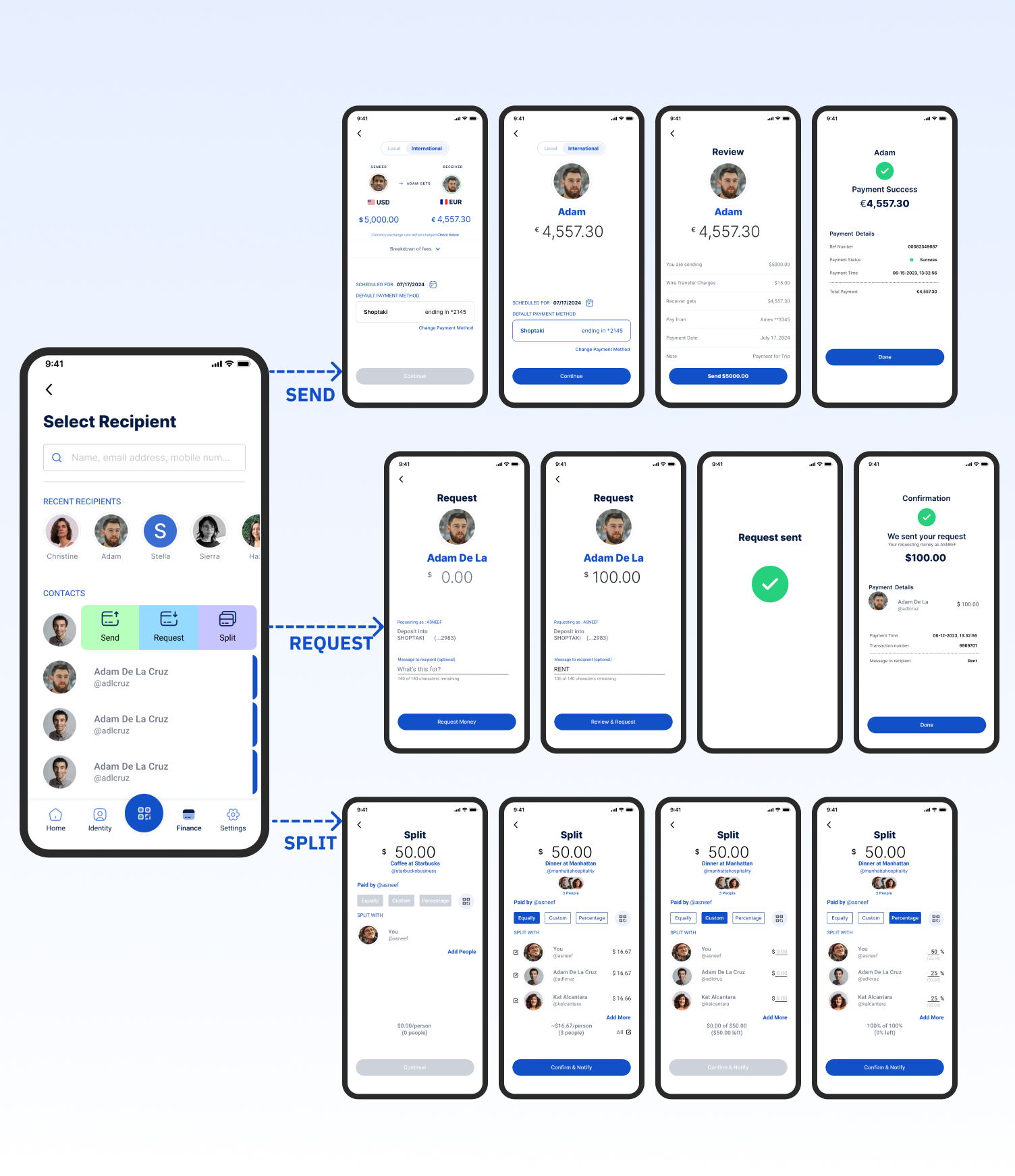
Designing the path forward with wireframes
//WIREFRAMES
- slide gesture prototype
THE NEW FLOW
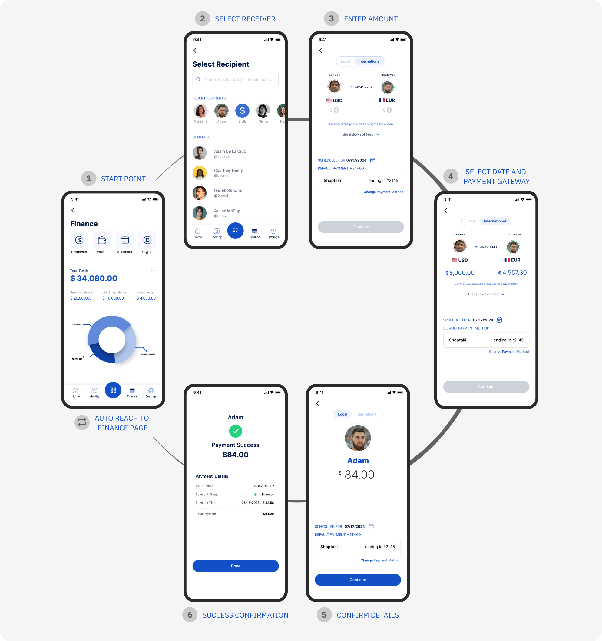
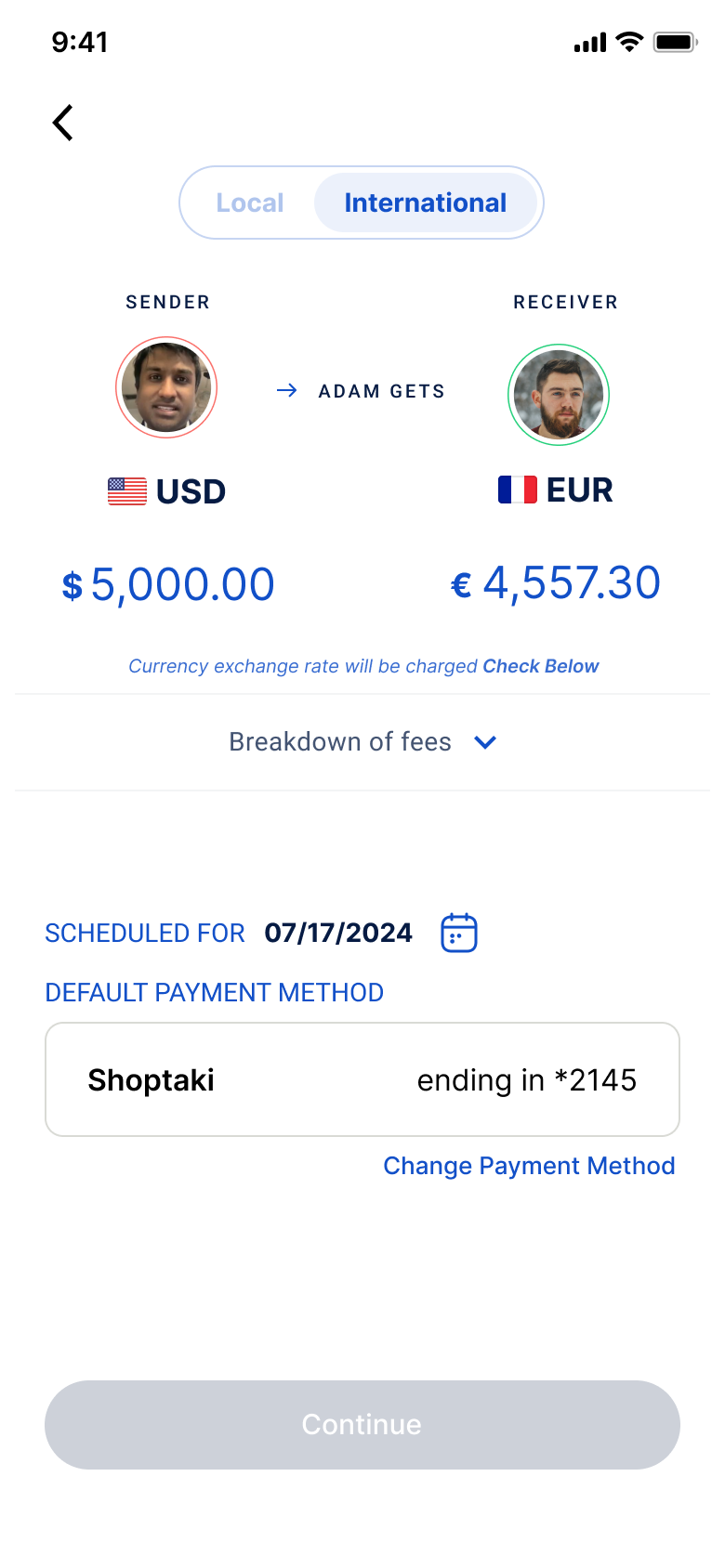
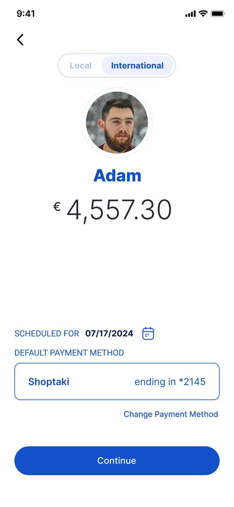
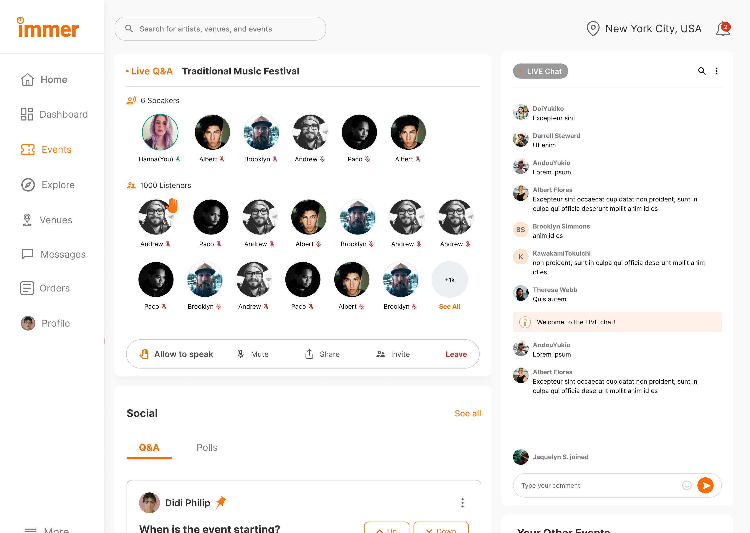
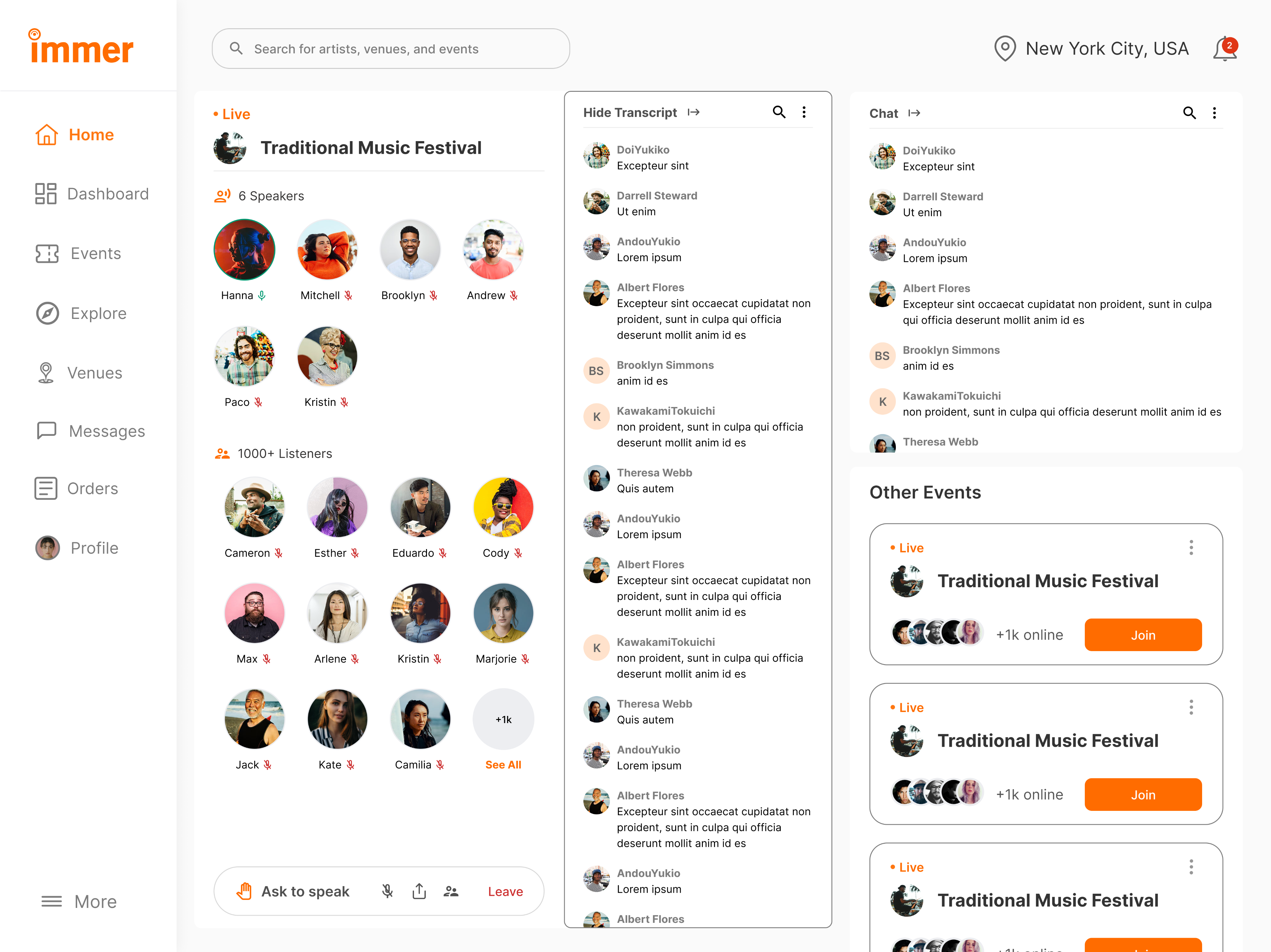
The Redesigned Finance Flow transformed how users interacted with payments. What once took six steps now reduced , with no need to return to the main page.
Before: Separate pages for Send, Request, Split → required re-navigation.
After: All actions live in one dynamic hub with instant switching.
- AFTER CHANGES METRICS •
15 Participants were interviewed
88%
Task success
9.3s
Avg. time per task
78/100
User satisfaction score

Key Takeaways
Designing for flow, not just function reducing friction between actions built user trust and made financial interactions feel effortless.

Final design outcome
Delivered a unified payment hub that removed repetitive navigation, reduced friction, and made every transaction faster, clearer, and more intuitive.
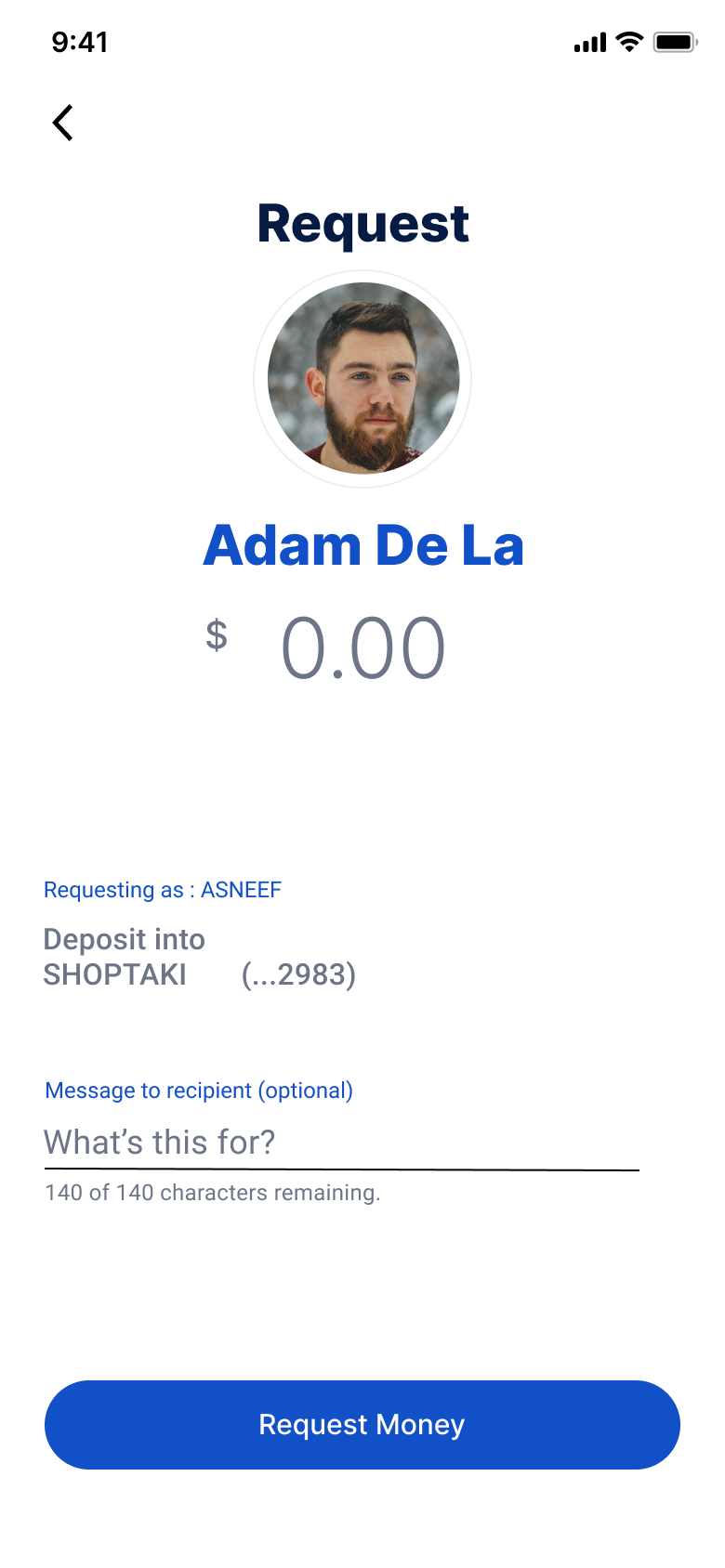
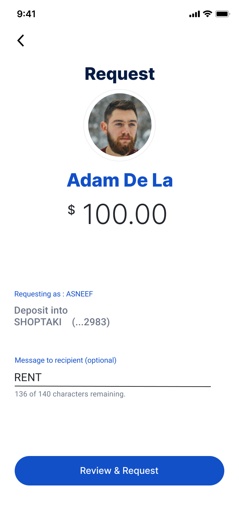
SLIDE GESTURE
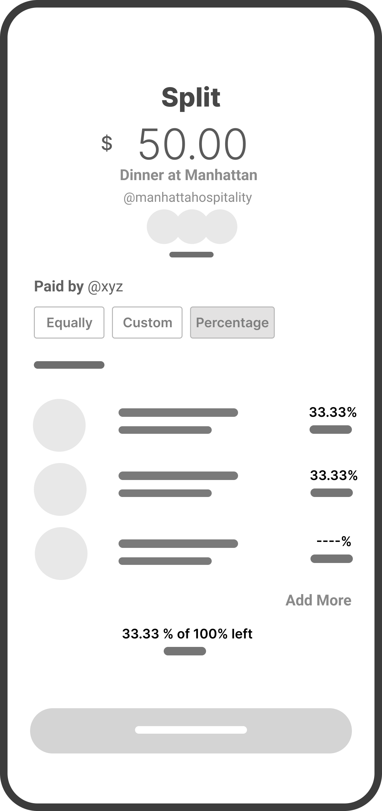
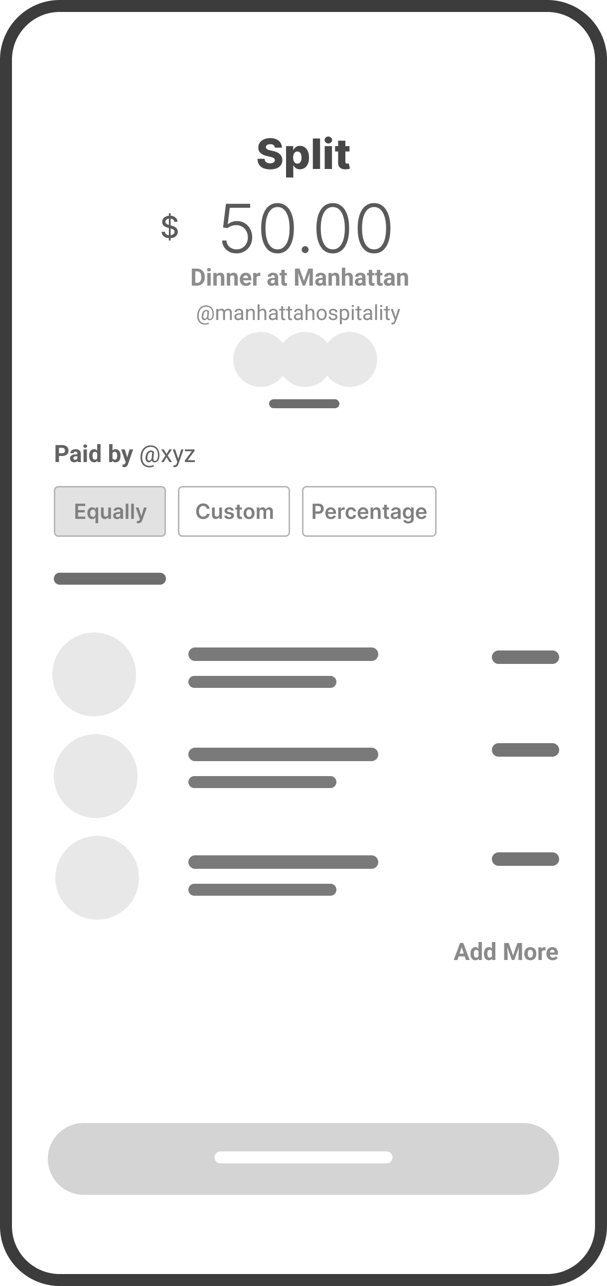
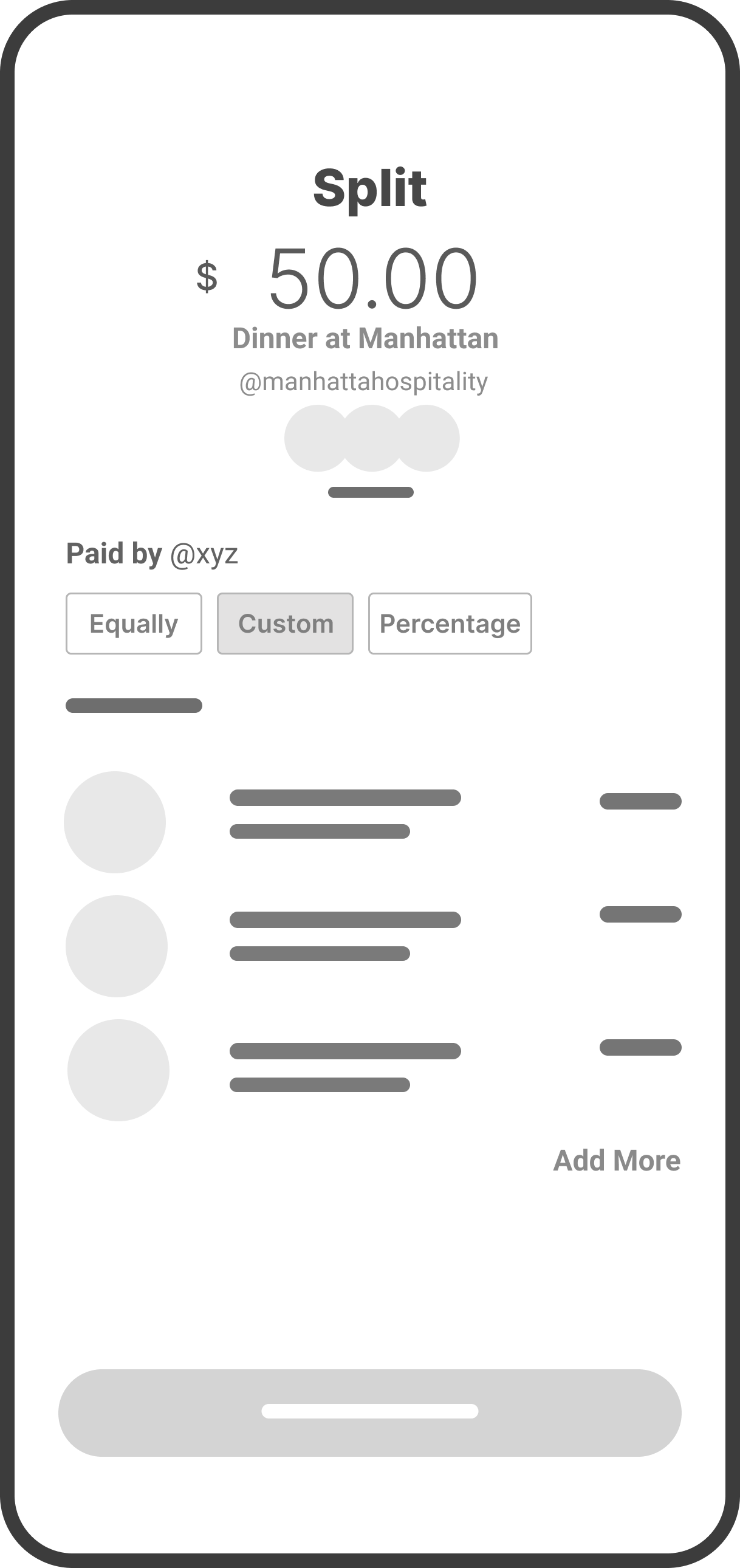
Send, Request, and Split actions together in one seamless space
Action Switcher
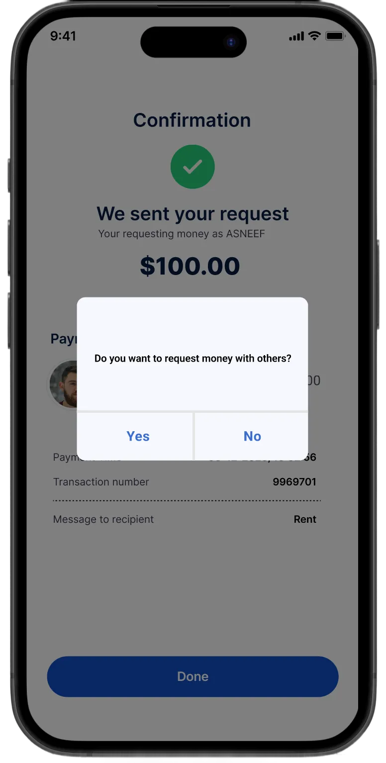
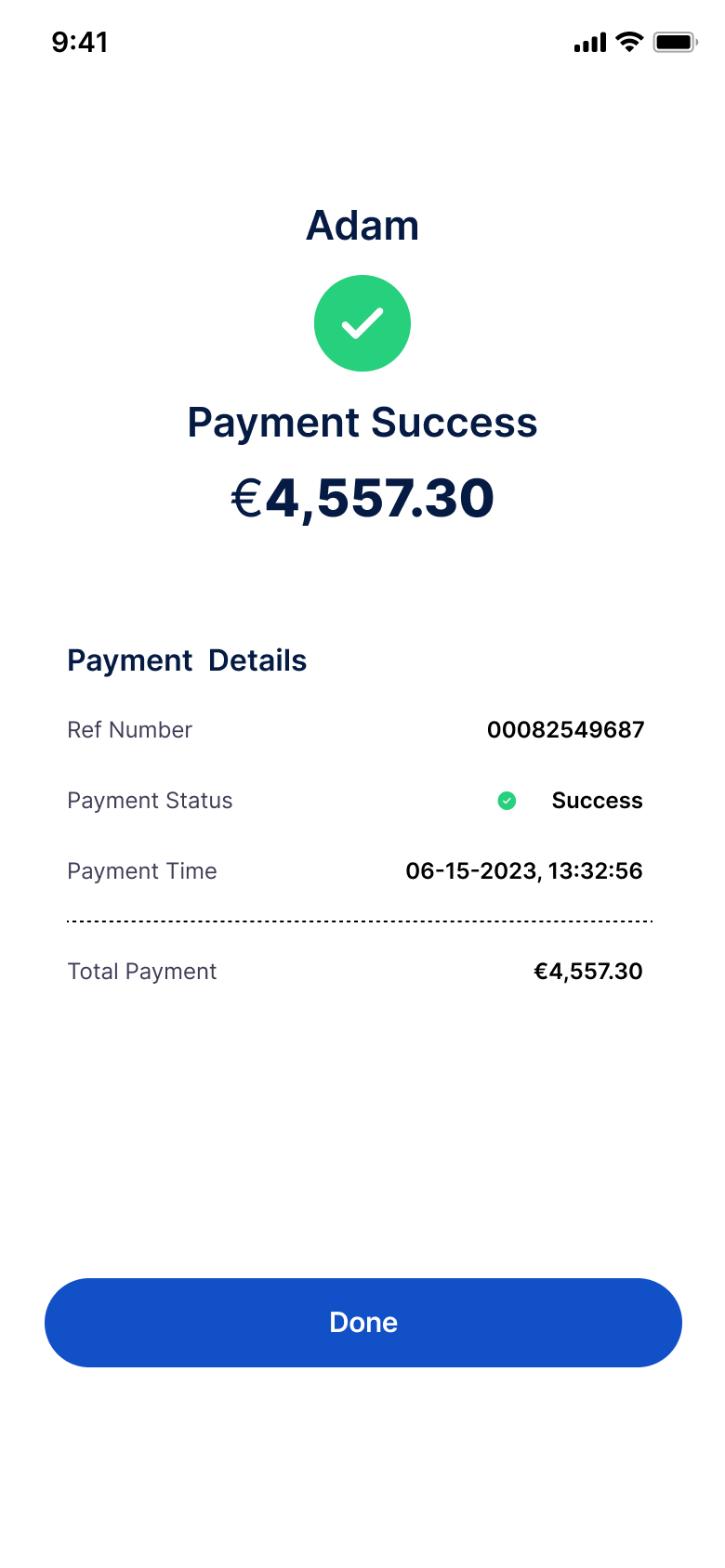
Real-Time Confirmation
ACTION POP UPS
This connected structure allowed users to complete multiple transactions without restarting, switch effortlessly between actions, and receive instant feedback
Continuous redirection
DESIGN SOLUTION
It’s so much faster now — I can send or request money without jumping back to the main screen every time..”- User after testing the updated identity verification flow
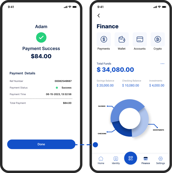
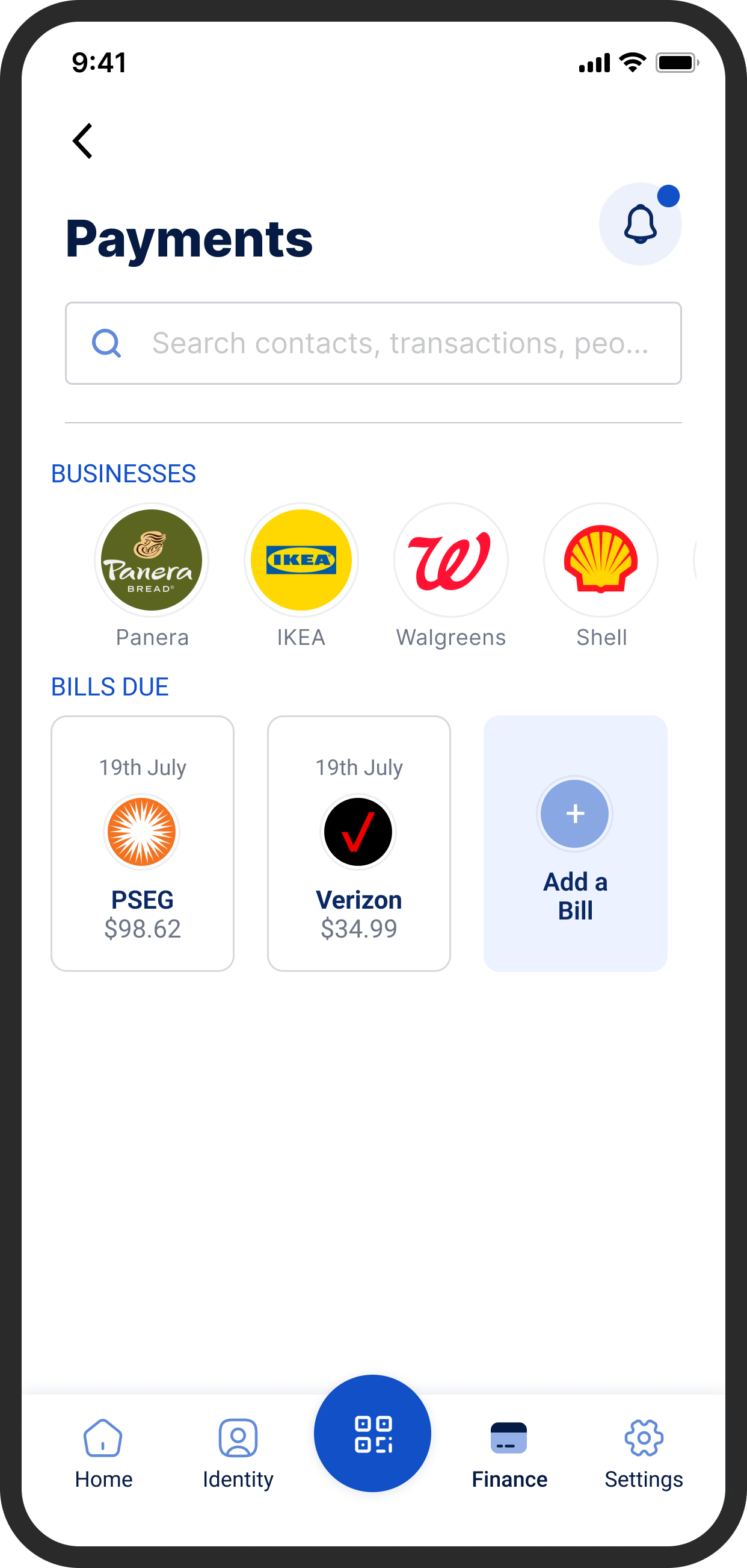
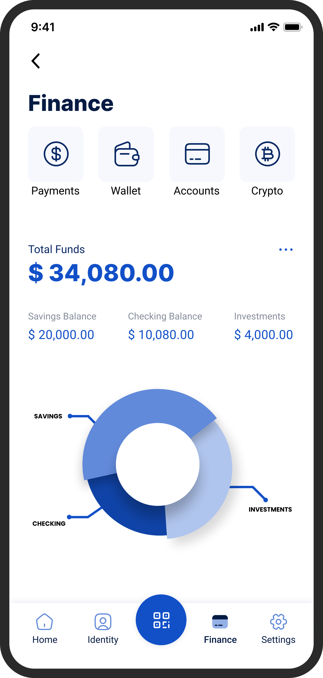
Implemented a unified multi-action payment hub that allows users to send, request, and split payments seamlessly within one screen. The redesigned flow eliminated unnecessary back-navigation, introduced real-time confirmations.
//HIFI DESIGNS
- translating design into data
FINAL RESULT

24% Improvement
Clarity and confidence, driven by real-time confirmations and simplified inputs throughout the payment journey.

17% Drop in Back-Clicks
Users completed payment tasks faster thanks to fewer steps and a unified action hub that removed unnecessary back-navigation.

27% Increase
In flow efficiency, as users could switch between Send, Request, and Split without resetting the process.
- always a learner
KEY TAKEAWAY AND LEARNINGS

Flow builds trust
I realized that in financial design, simplicity equals confidence. Every extra tap or redirection wasn’t just a usability flaw, it was a trust gap. By reducing unnecessary steps, users began to feel more in control of their actions, and that sense of confidence reflected directly in how they described the experience.

Feedback Creates Assurance
Adding real-time confirmations and success cues wasn’t just a design upgrade; it built emotional reassurance. Clear feedback loops turned moments of hesitation into moments of confidence.

Design for Continuity, Not Just Completion
The redesign wasn’t about solving one flow, it was about creating a system that could grow. By building flexible components and dynamic states, the new finance experience can adapt to new payment types or financial tools without breaking consistency.
Browse more work


Trust & Security

Designed Security Flow: Smart ID at Shoptaki, boosting usability by 15% and creating engaging interfaces, creating seamless flow

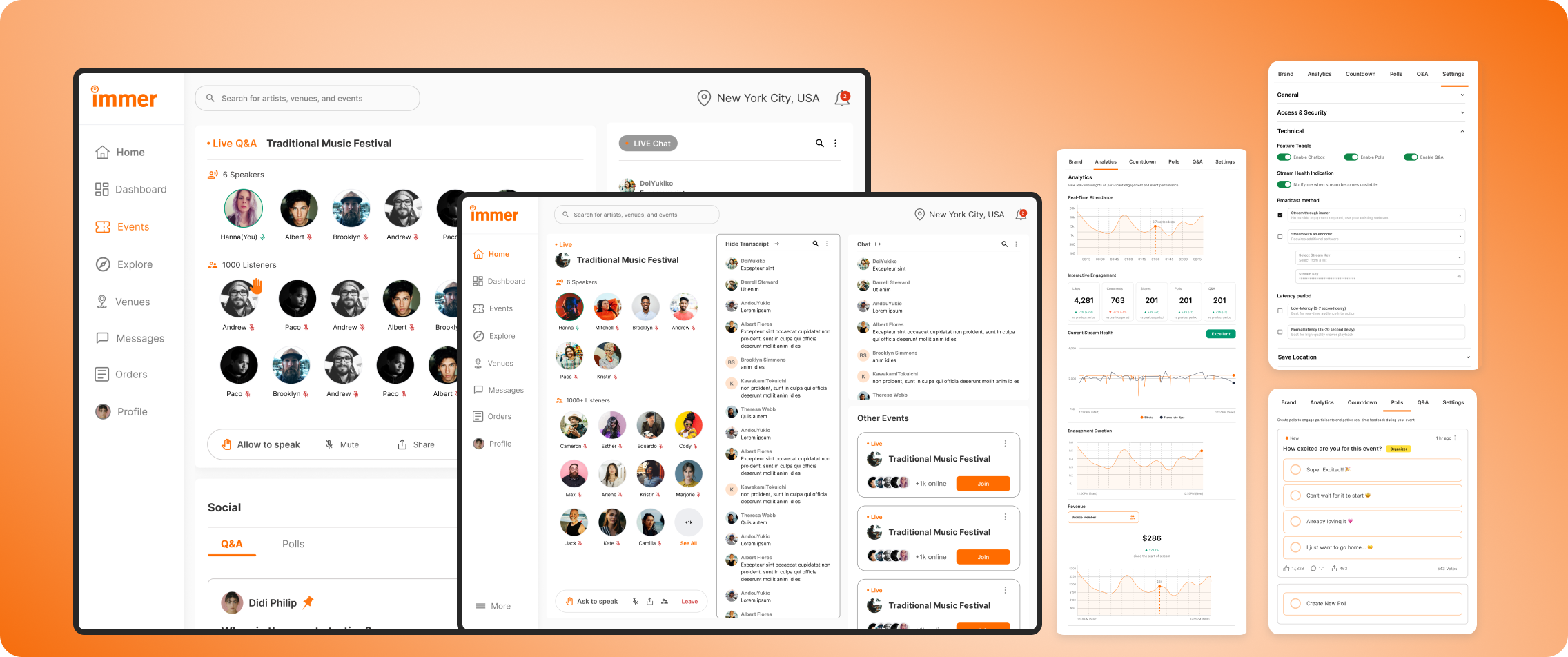
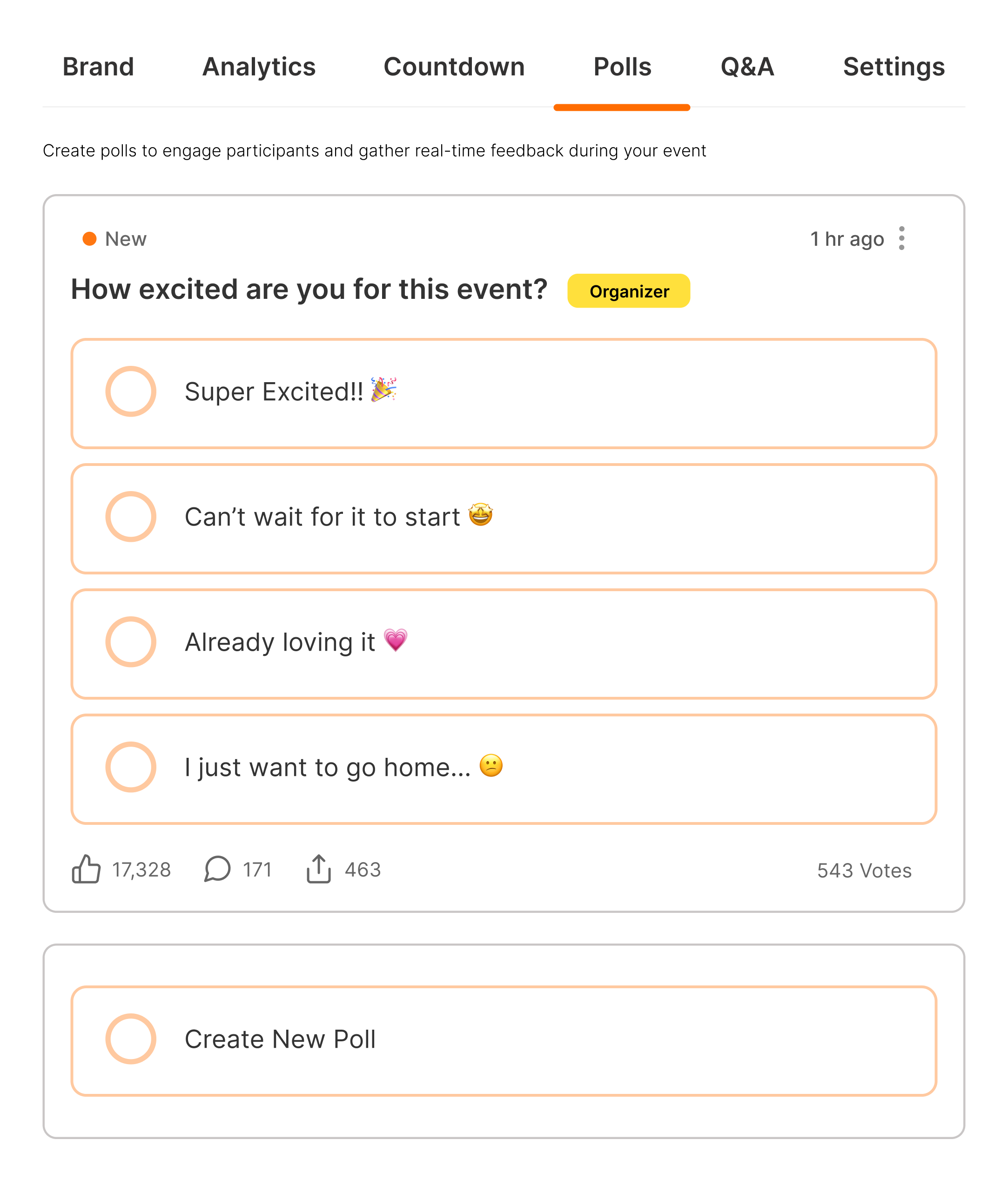
Live Audio Chat & Real-Time Engagement
Researched and redesigned the organizer experience for an event services and ticketing app, improving user flows, incerasing user engagement by 22%, and enhancing usability testing.

x

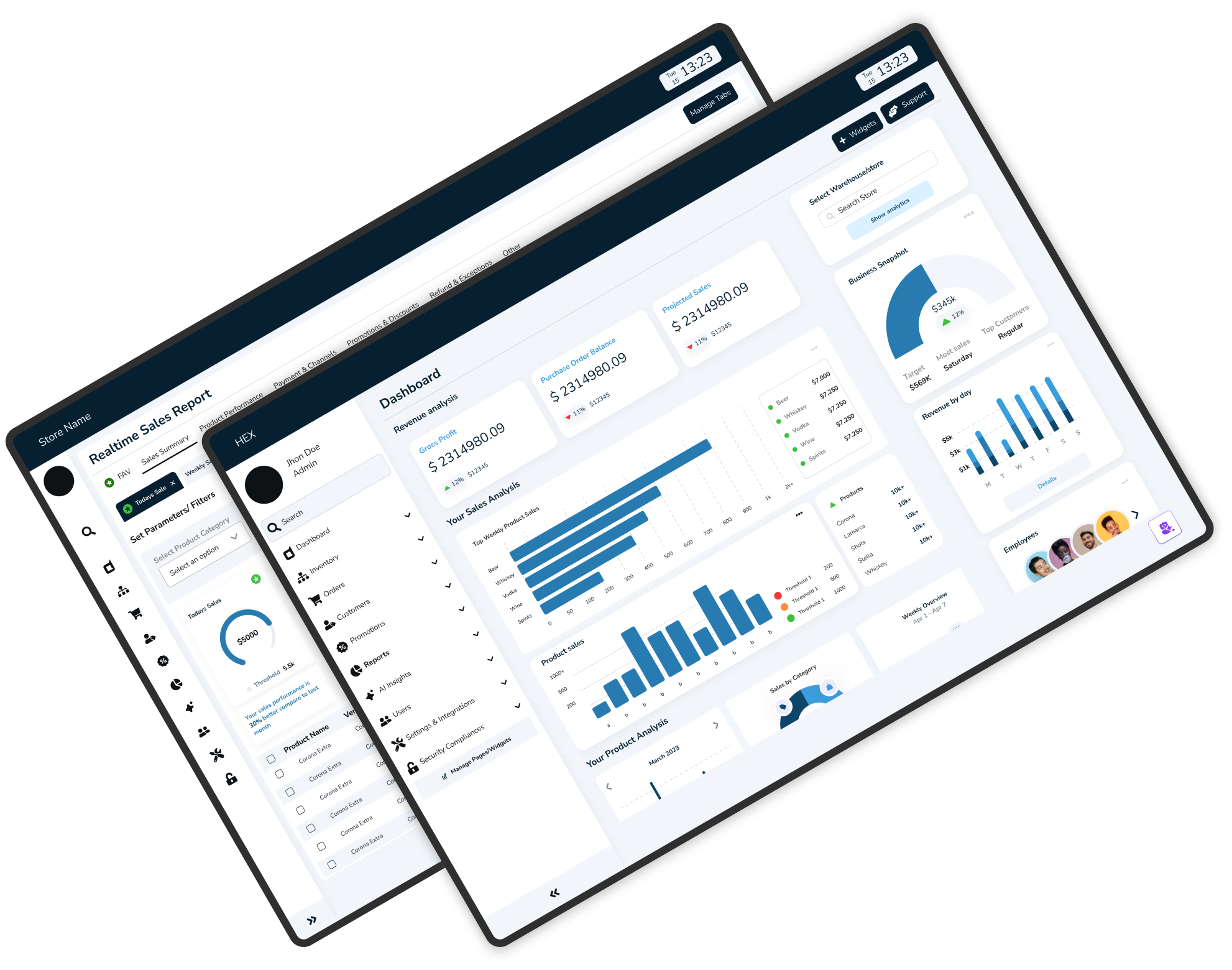
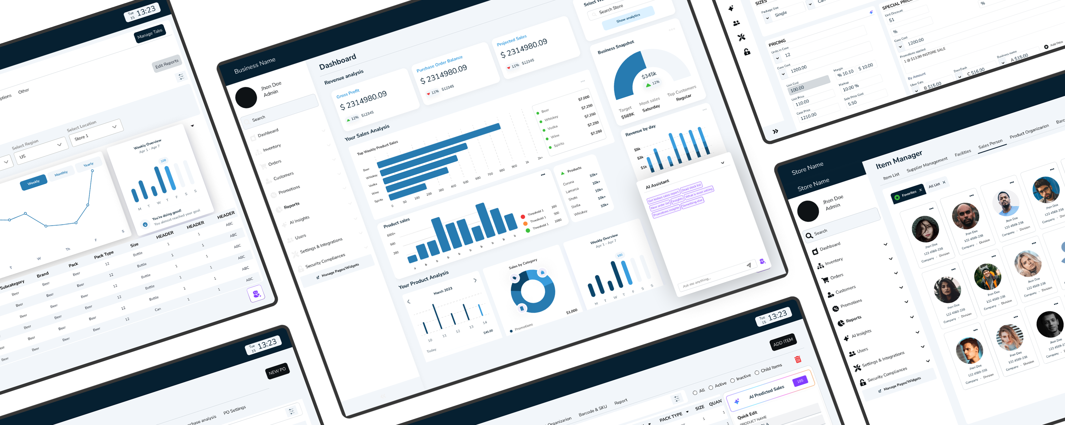
Research to Live Project design
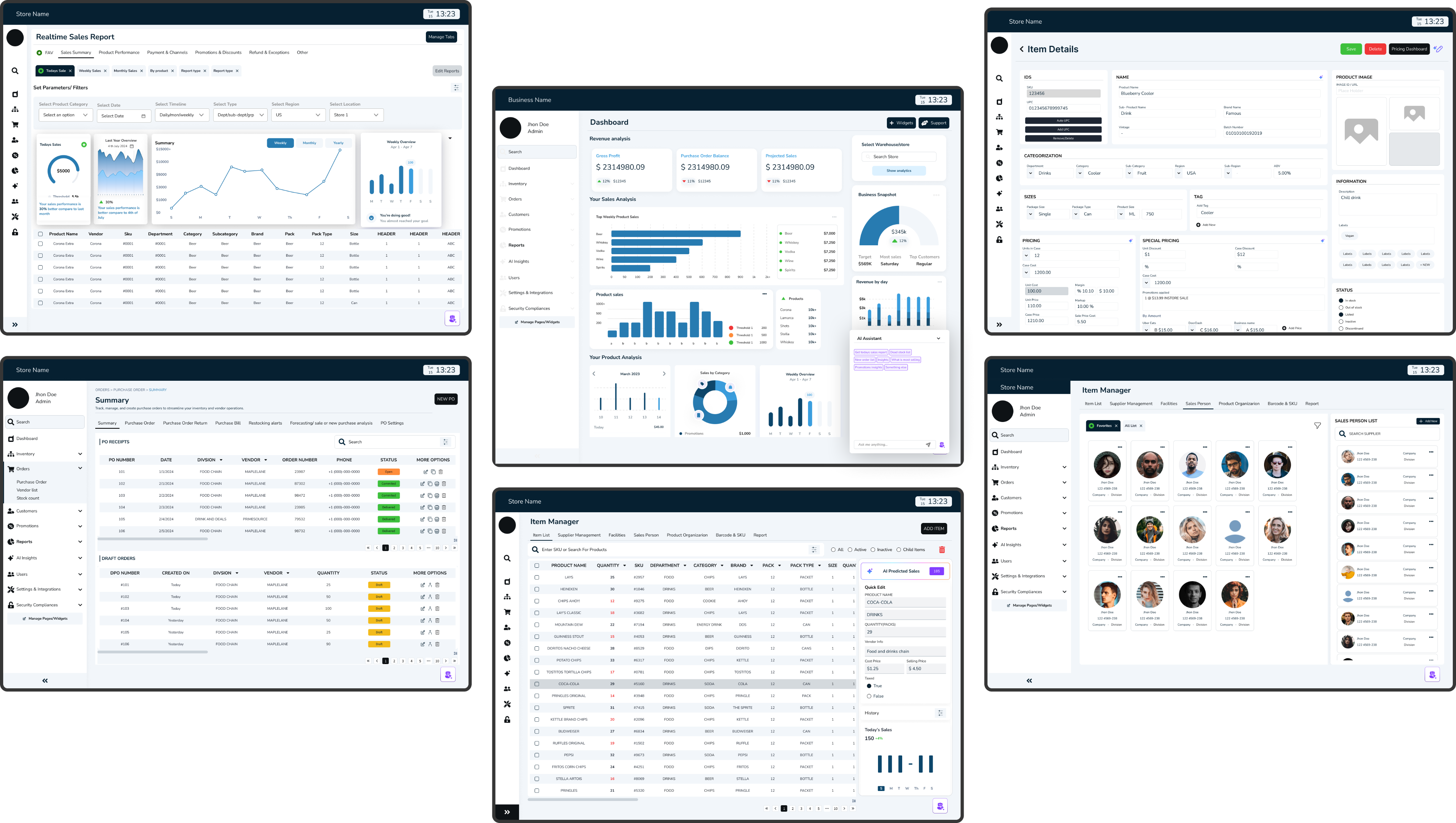
Designed an POS Admin dashboard that unified orders, analytics, and AI insights helping store owners turn data, reports into effortless business clarity

Designing Flow: Making Every Transaction Effortless
Created a frictionless way for users to send, request, and split payments without jumping screens
MY ROLE
Product Designer
TIMELINE
5+ months | 2 phases to launch
TEAM
2 Designers, 1 Product Managers, 4 Developers, 4 Data Analyst
PROBLEM
Users faced friction while performing financial actions, they had to return to the main page every time to switch between Send, Request, and Split transactions which created confusion, increased completion time, and disrupted the overall user flow.
OUTCOME
Redesigned SmartID’s Finance Flow into a unified, intuitive payment hub enabling users to send, request, and split payments within one screen, reducing completion time by 24% and enhancing clarity, trust, and confidence in every transaction.
-understanding “why” it needs fixing
WHERE USERS STRUGGLED
During early usability sessions, the same feedback surfaced again and again:
Instead of trust and simplicity, the experience felt fragmented.
Objective
Design a smooth and intuitive finance flow that lets users manage payments confidently, reducing friction and repetitive steps for a faster, more connected experience.
Challenge
Reimagine the finance experience as a single, connected flow one where users can send, request, and split payments without interruption by focusing on continuity, visibility, and instant feedback, the redesign had the opportunity to turn repetitive transactions into a seamless, confidence-building experience.
- discovering user truths
FINDING THE GAPS
When I presented SmartID’s early designs to investors, the reaction echoed what I had already seen in usability tests.
//userproblem01
“After every successful payment, I’m taken back to the main Finance page. It breaks my flow , I just want to continue from where I left off.”
Old flow forcing users to return to Finance Home after each transaction
//userproblem02
“There’s no quick way to resend money. I wish I could see my recent payments or contacts right at the top instead of searching again.”
Missing ‘Recent Payments’ section causing repetitive manual searches.
//userproblem03
“I land to same home page after each transaction, its frustrating to come back again to this page every time.”
Missing ‘Recent Payments’ section causing repetitive manual searches.
-identifying core problems
USER PAIN POINTS
Noted pain points and design gap
Too Many Steps
6+ clicks to complete a single payment to multiple payment.

Cognitive Overload
Constant back-and-forth made users second-guess every tap.
Fragmented Navigation
Each action lived in isolation, forcing context-switching.
Before: Design Flow
- BEFORE CHANGES METRICS •
15 Participants were interviewed
5 Tasks
30 minute session
Moderated testing
Heuristic evaluations
Mental modal
Surveys
Post-test questionnaires
64%
Task success
12.8s
Avg. time per task
59/100
User satisfaction score
Key Takeaways
Designing for flow, not just function reducing friction between actions built user trust and made financial interactions feel effortless.
-testing, wireframing, refining
REDESIGNING FOR SIMPLICITY
//INITIAL DEISGN ITERATIONS
PHASE 01: DESIGN

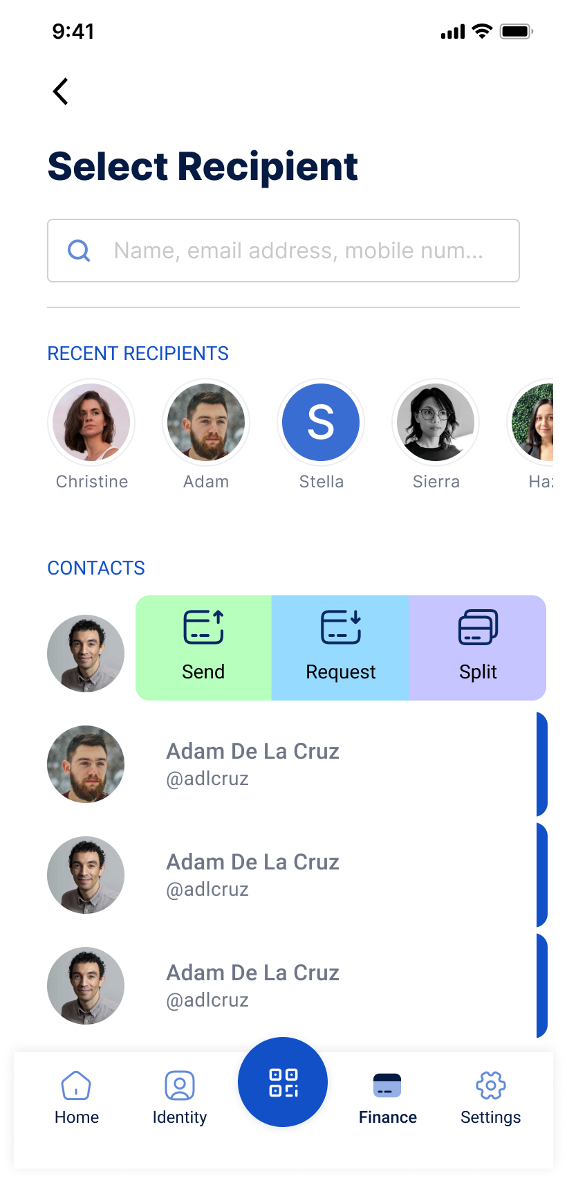
Had to search for the contact every time to make any payment or transaction.
I like that it shows the contact list, but managing multiple actions like split and request means coming back here each time to do them individually.

PHASE 02: UPADTES
PHASE 03: NEW ACTIONS

The three-action layout looked simple but broke flow—users had to reselect contacts after each task; a swipe-to-action gesture proved faster, smoother, and more natural.
GOALS
Turned user concerns into design priorities
Smarter Payment Flow
Allow users to switch between Send, Request, and Split without leaving the screen.
Inline Confirmation
Show success messages immediately after each action
Reduced Steps
Bring transactions down to under 5 clicks
Designing the path forward with wireframes
//WIREFRAMES
- slide gesture prototype
THE NEW FLOW
The Redesigned Finance Flow transformed how users interacted with payments. What once took six steps now reduced , with no need to return to the main page.
Before: Separate pages for Send, Request, Split → required re-navigation.
After: All actions live in one dynamic hub with instant switching.
- AFTER CHANGES METRICS •
15 Participants were interviewed
88%
Task success
9.3s
Avg. time per task
78/100
User satisfaction score
Key Takeaways
Designing for flow, not just function reducing friction between actions built user trust and made financial interactions feel effortless.
Final design outcome
Delivered a unified payment hub that removed repetitive navigation, reduced friction, and made every transaction faster, clearer, and more intuitive.
SLIDE GESTURE

Send, Request, and Split actions together in one seamless space
Action Switcher
Real-Time Confirmation
ACTION POP UPS
This connected structure allowed users to complete multiple transactions without restarting, switch effortlessly between actions, and receive instant feedback
Continuous redirection
DESIGN SOLUTION
It’s so much faster now — I can send or request money without jumping back to the main screen every time..”- User after testing the updated identity verification flow
Implemented a unified multi-action payment hub that allows users to send, request, and split payments seamlessly within one screen. The redesigned flow eliminated unnecessary back-navigation, introduced real-time confirmations.


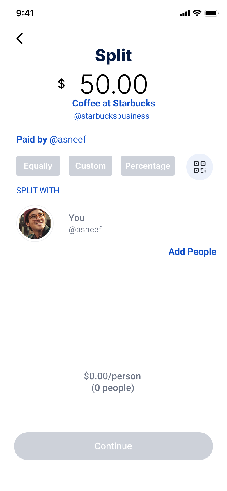
SEND
REQUEST
SPLIT
//HIFI DESIGNS
- translating design into data
FINAL RESULT
24% Improvement
Clarity and confidence, driven by real-time confirmations and simplified inputs throughout the payment journey.

17% Drop in Back-Clicks
Users completed payment tasks faster thanks to fewer steps and a unified action hub that removed unnecessary back-navigation.
27% Increase
In flow efficiency, as users could switch between Send, Request, and Split without resetting the process.
- always a learner
KEY TAKEAWAY AND LEARNINGS
Flow builds trust
I realized that in financial design, simplicity equals confidence. Every extra tap or redirection wasn’t just a usability flaw, it was a trust gap. By reducing unnecessary steps, users began to feel more in control of their actions, and that sense of confidence reflected directly in how they described the experience.
Feedback Creates Assurance
Adding real-time confirmations and success cues wasn’t just a design upgrade; it built emotional reassurance. Clear feedback loops turned moments of hesitation into moments of confidence.
Design for Continuity, Not Just Completion
The redesign wasn’t about solving one flow, it was about creating a system that could grow. By building flexible components and dynamic states, the new finance experience can adapt to new payment types or financial tools without breaking consistency.
Browse more work
Built Trust
Product Designer
User Research
B2B
SaaS
Most impactful
Trust & Security
Designed Security Flow: Smart ID at Shoptaki, boosting usability by 15% and creating engaging interfaces, creating seamless flow
Built Emotion
UX/UI Design
User Research
B2C
SaaS
Entertainment service
Most impactful
Live Audio Chat & Real-Time Engagement
Researched and redesigned the organizer experience for an event services and ticketing app, improving user flows, incerasing user engagement by 22%, and enhancing usability testing.
X
Built Systems
Product designer
POS System
AI
SaaS
Complex Data
B2B
Enterprise
Research to Live Project design
Designed an POS Admin dashboard that unified orders, analytics, and AI insights helping store owners turn data, reports into effortless business clarity
Designing Flow: Making Every Transaction Effortless
Created a frictionless way for users to send, request, and split payments without jumping screens
MY ROLE
Product Designer
TIMELINE
5+ months | 2 phases to launch
TEAM
2 Designers, 1 Product Managers, 4 Developers, 4 Data Analyst
PROBLEM
Users faced friction while performing financial actions, they had to return to the main page every time to switch between Send, Request, and Split transactions which created confusion, increased completion time, and disrupted the overall user flow.
OUTCOME
Redesigned SmartID’s Finance Flow into a unified, intuitive payment hub enabling users to send, request, and split payments within one screen, reducing completion time by 24% and enhancing clarity, trust, and confidence in every transaction.
-understanding “why” it needs fixing
WHERE USERS STRUGGLED
During early usability sessions, the same feedback surfaced again and again:
“Why do I have to keep going back just to switch between sending or requesting money?”
The original flow was rigid each transaction type (Send, Request, Split) lived on same pages but every time user needed to step to the home to initiate a new type of transaction
This meant completing one task forced users to retrace their steps to the main page, leading to frustration, confusion, and unnecessary clicks. Instead of creating clarity, the design added friction to the simplest of actions.
Objective
Design a smooth and intuitive finance flow that lets users manage payments seamlessly, reducing friction and repetitive steps for a faster, more connected experience.
Challenge
Reimagine the finance experience as a single, connected flow one where users can send, request, and split payments without interruption by focusing on continuity, visibility, and instant feedback, the redesign had the opportunity to turn repetitive transactions into a seamless, confidence-building experience.
- discovering user truths
FINDING THE GAPS
I ran 12 user interviews and 6 task-based usability tests, focusing on completion time, success rate, and user satisfaction.
The data revealed key problem areas:
//userproblem01
“After every successful payment, I’m taken back to the main Finance page. It breaks my flow , I just want to continue from where I left off.”
Old flow forcing users to return to Finance Home after each transaction
//userproblem02
“There’s no quick way to resend money. I wish I could see my recent payments or contacts right at the top instead of searching again.”
Missing ‘Recent Payments’ section causing repetitive manual searches.
//userproblem03
“I land to same home page after each transaction, its frustrating to come back again to this page every time.”
Missing ‘Recent Payments’ section causing repetitive manual searches.
-identifying core problems
USER PAIN POINTS
Noted pain points and design gap
Too Many Steps
6+ clicks to complete a single payment to multiple payment.
Cognitive Overload
Constant back-and-forth made users second-guess every tap.
Fragmented Navigation
Each action lived in isolation, forcing context-switching.
Before: Separate pages for Send, Request, Split → required re-navigation.
Before: Design Flow
- BEFORE CHANGES METRICS •
15 Participants were interviewed
5 Tasks
30 minute session
Moderated testing
Heuristic evaluations
Mental modal
Surveys
Post-test questionnaires
64%
Task success
12.8s
Avg. time per task
59/100
User satisfaction score
Key Takeaways
Designing for flow, not just function reducing friction between actions built user trust and made financial interactions feel effortless.
-testing, wireframing, refining
REDESIGNING FOR SIMPLICITY
//INITIAL DEISGN ITERATIONS
PHASE 01: DESIGN

Had to search for the contact every time to make any payment or transaction.
I like that it shows the contact list, but managing multiple actions like split and request means coming back here each time to do them individually.

PHASE 02: UPADTES
PHASE 03: NEW ACTIONS

The three-action layout looked simple but broke flow—users had to reselect contacts after each task; a swipe-to-action gesture proved faster, smoother, and more natural.
GOALS
Turned user concerns into design priorities
Smarter Payment Flow
Allow users to switch between Send, Request, and Split without leaving the screen.

Inline Confirmation
Show success messages immediately after each action
Reduced Steps
Bring transactions down to under 5 clicks
Design Exploration
Through rapid wire framing and mid-fidelity prototyping, I tested multiple interaction patterns.
Users consistently preferred the single-hub experience, a dynamic interface where they could switch actions fluidly within one screen.
//WIREFRAMES
- slide gesture prototype
THE NEW FLOW
The Redesigned Finance Flow transformed how users interacted with payments. What once took six steps now reduced , with no need to return to the main page.
Before: Separate pages for Send, Request, Split → required re-navigation.
After: All actions live in one dynamic hub with instant switching.
- AFTER CHANGES METRICS •
15 Participants were interviewed
5 Tasks
30 minute session
Moderated testing
Heuristic evaluations
Mental modal
Surveys
Post-test questionnaires
88%
Task success
9.3s
Avg. time per task
78/100
User satisfaction score
Key Takeaways
Designing for flow, not just function reducing friction between actions built user trust and made financial interactions feel effortless.
Final design outcome
Delivered a unified payment hub that removed repetitive navigation, reduced friction, and made every transaction faster, clearer, and more intuitive.
SLIDE GESTURE
Send, Request, and Split actions together in one seamless space
Action Switcher
Real-Time Confirmation
ACTION POP UPS
This connected structure allowed users to complete multiple transactions without restarting, switch effortlessly between actions, and receive instant feedback
Continuous redirection
DESIGN SOLUTION
“It’s so much faster now, I can send or request money without jumping back to the main screen every time.”- User after testing the updated identity verification flow
Implemented a unified multi-action payment hub that allows users to send, request, and split payments seamlessly within one screen. The redesigned flow eliminated unnecessary back-navigation, introduced real-time confirmations.


SEND
REQUEST
SPLIT
//HIFI DESIGNS
- translating design into data
FINAL RESULT
24% Improvement
Clarity and confidence, driven by real-time confirmations and simplified inputs throughout the payment journey.
17% Drop in Back-Clicks
Users completed payment tasks faster thanks to fewer steps and a unified action hub that removed unnecessary back-navigation.
27% Increase
In flow efficiency, as users could switch between Send, Request, and Split without resetting the process.
- designing my way to understanding
KEY TAKEAWAY AND LEARNINGS
Flow builds trust
I realized that in financial design, simplicity equals confidence. Every extra tap or redirection wasn’t just a usability flaw, it was a trust gap. By reducing unnecessary steps, users began to feel more in control of their actions, and that sense of confidence reflected directly in how they described the experience.

Feedback Creates Assurance
Adding real-time confirmations and success cues wasn’t just a design upgrade; it built emotional reassurance. Clear feedback loops turned moments of hesitation into moments of confidence.

Design for Continuity, Not Just Completion
The redesign wasn’t about solving one flow, it was about creating a system that could grow. By building flexible components and dynamic states, the new finance experience can adapt to new payment types or financial tools without breaking consistency.
Browse more work
Built Trust
Product designer
User Research
B2B
SaaS
Most impactful
Trust & Security
Designed Security Flow: Smart ID at Shoptaki, boosting usability by 15% and creating engaging interfaces, creating seamless flow
Built Emotion
UX/UI Design
User Research
B2C
SaaS
Entertainment service
Most impactful
Live Audio Chat & Real-Time Engagement
Researched and redesigned the organizer experience for an event services and ticketing app, improving user flows, incerasing user engagement by 22%, and enhancing usability testing.
X
Built Systems
Product designer
POS System
AI
SaaS
Complex Data
B2B
Enterprise
Research to Live Project design
Designed an POS Admin dashboard that unified orders, analytics, and AI insights helping store owners turn data, reports into effortless business clarity