Designing an AI-powered POS System for Smarter Store Management
Designed an intelligent POS dashboard that unified orders, analytics, and AI insights helping store owners turn data into effortless business clarity.
MY ROLE
Product Designer
TIMELINE
4 Sprints | Product Cycle
TEAM
Sole designer, 1 Product Lead, 1 Full stack developer
PROBLEM
Existing POS system used disconnected tools for orders, inventory, and reporting, creating inconsistent workflows and scattered insights. Admins lacked real-time data visibility, slowing decisions and increasing manual work.
OUTCOME
Redesigned the POS experience with a unified, insight-driven dashboard featuring real-time analytics, clearer data flows between admin and manager roles, and AI
assisted summaries that transformed raw numbers into actionable guidance, making daily operations faster and easier to navigate.
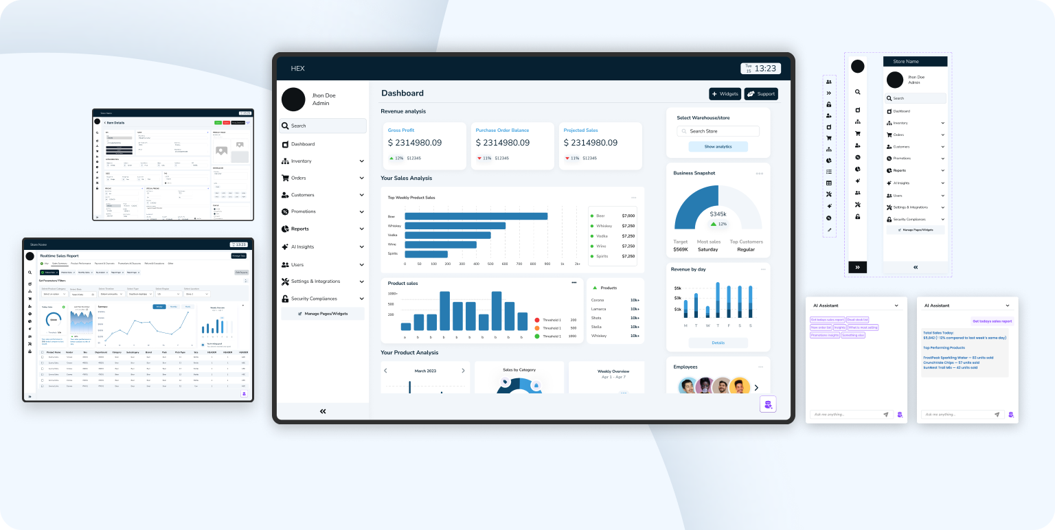
Let's preview the final solution before going through the steps
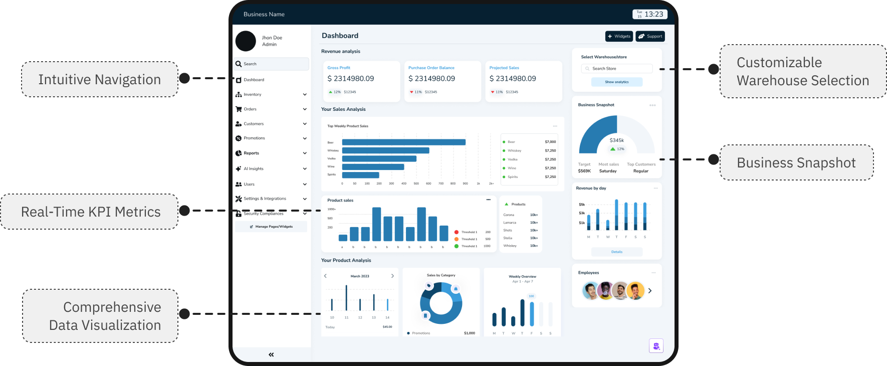
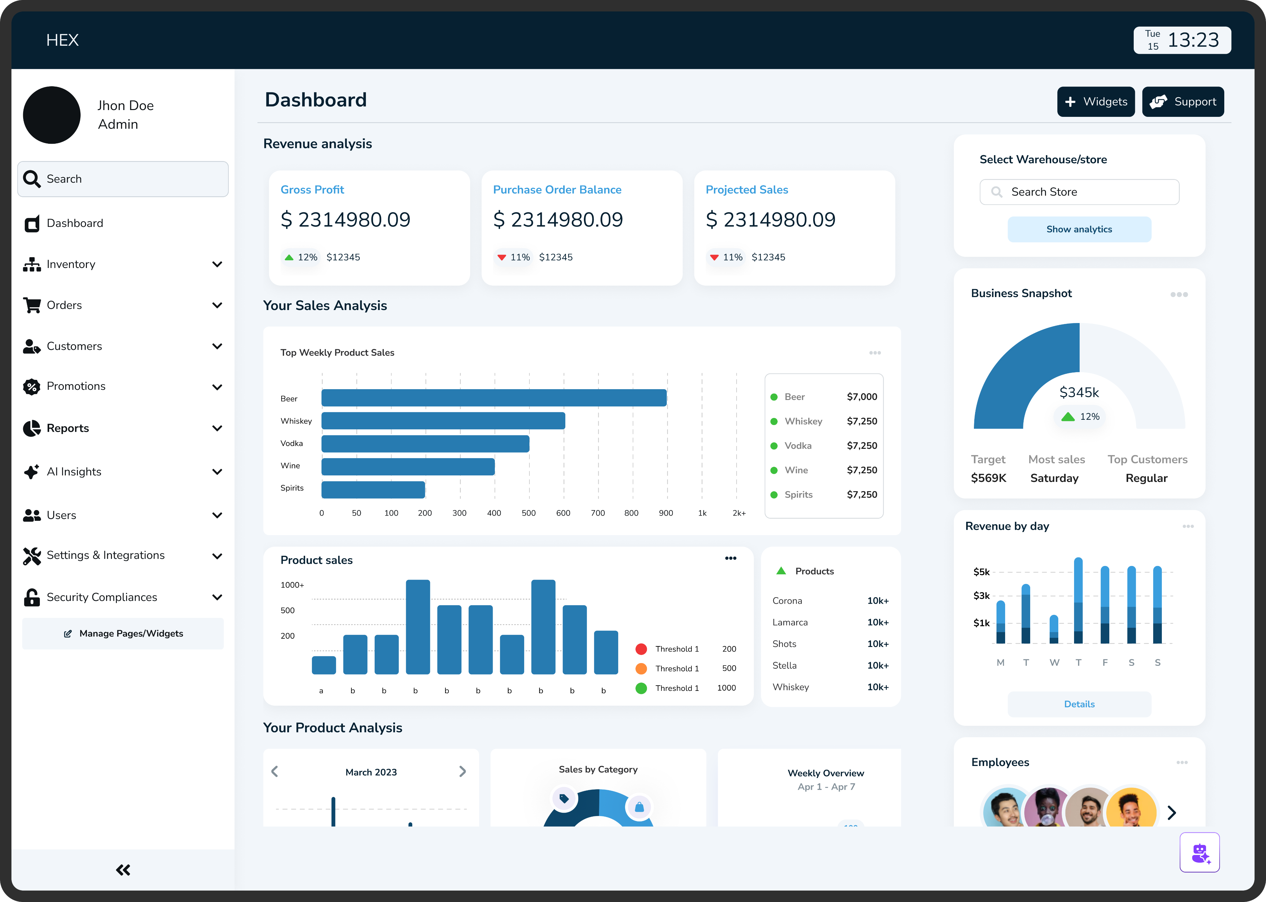
Admin dashboard
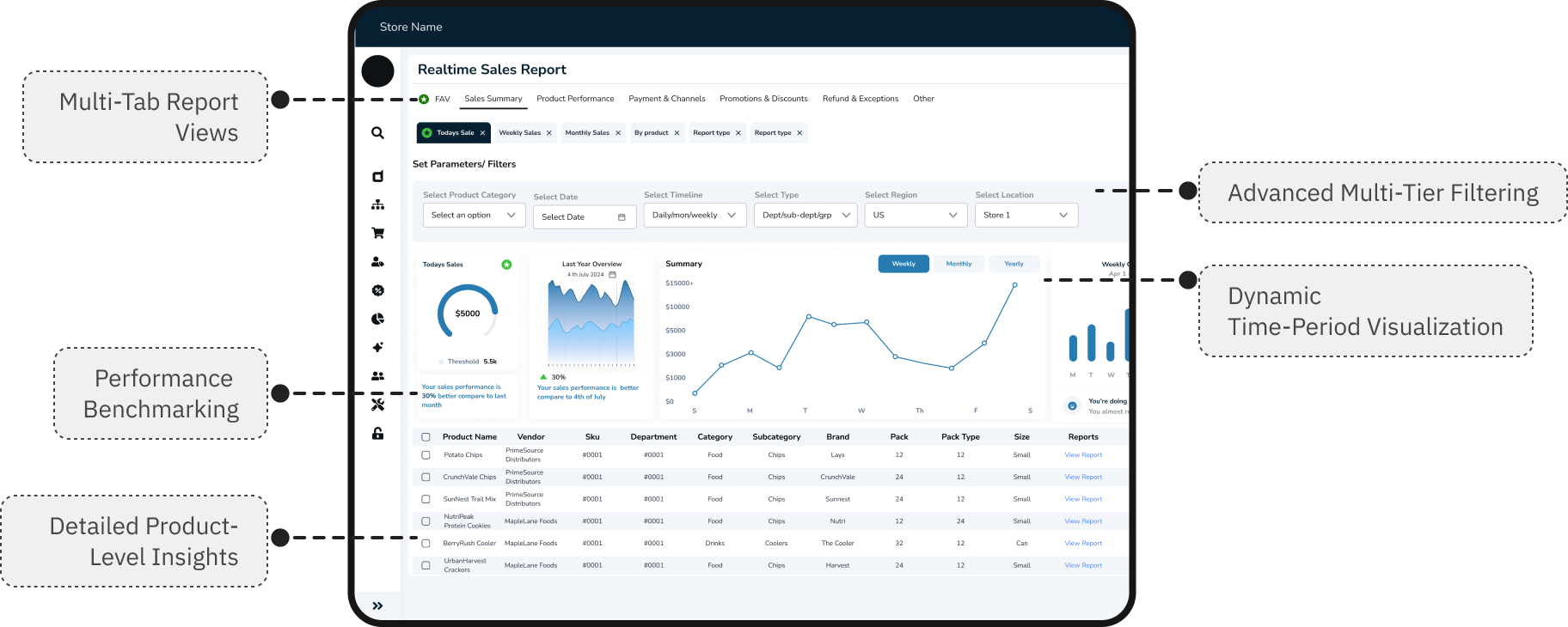
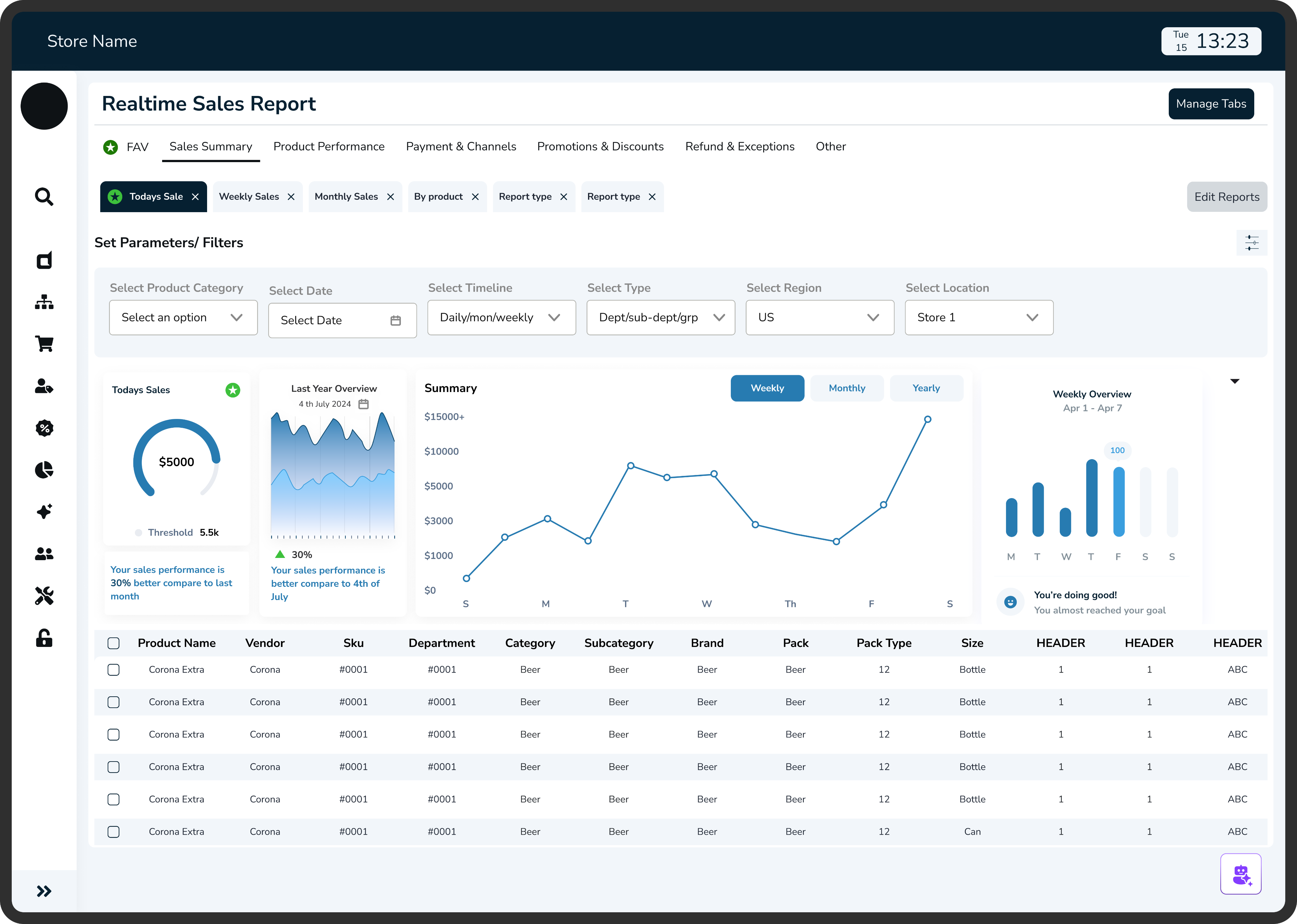
Reports analytics
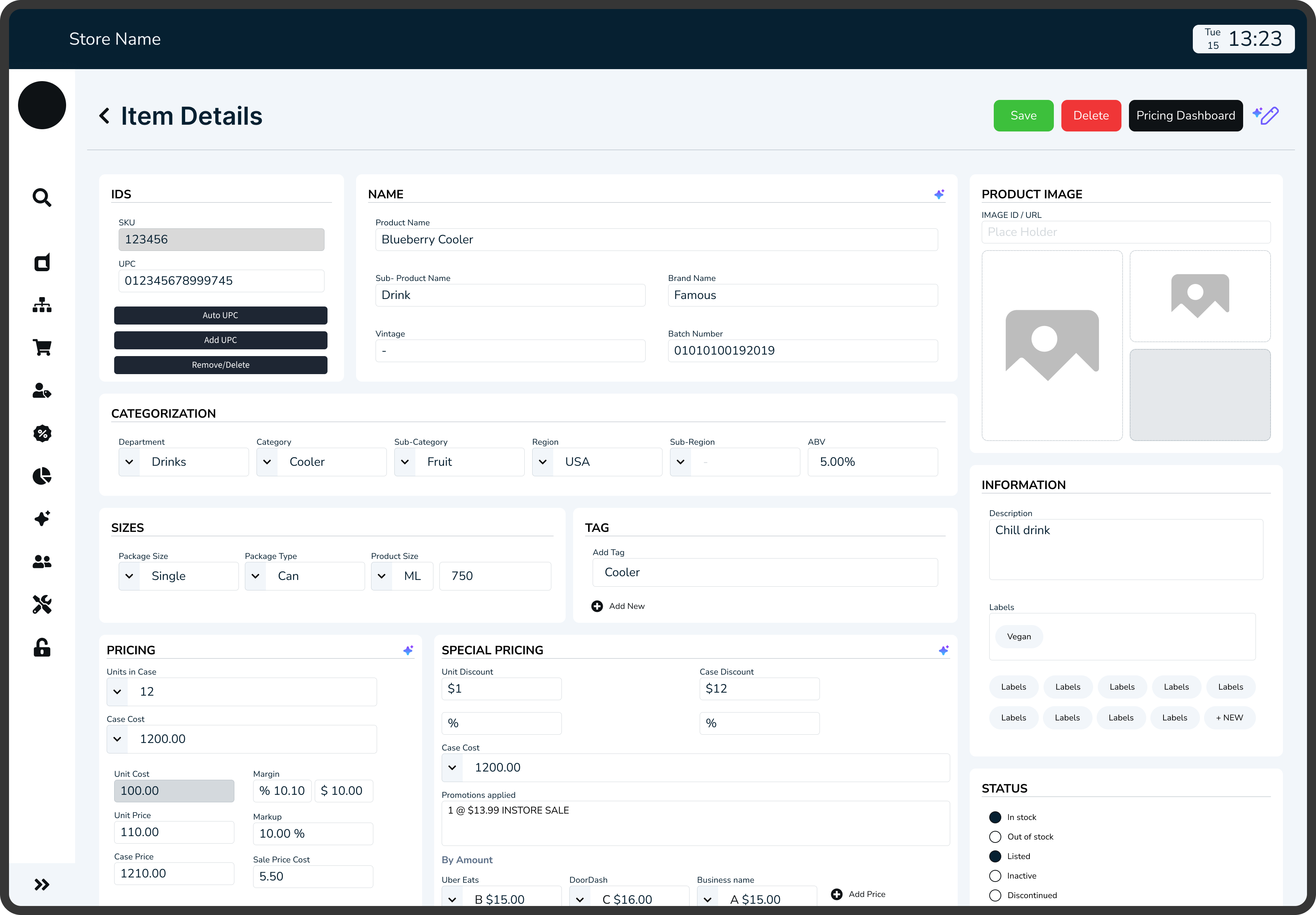
Adding new inventory
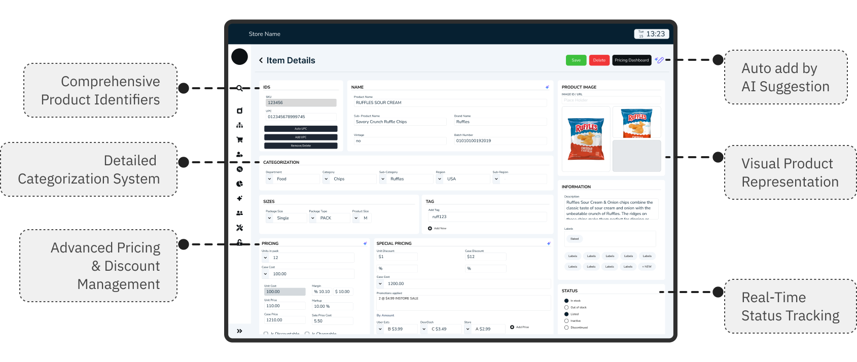
WHAT WAS BROKEN: OLD POS SYSTEM

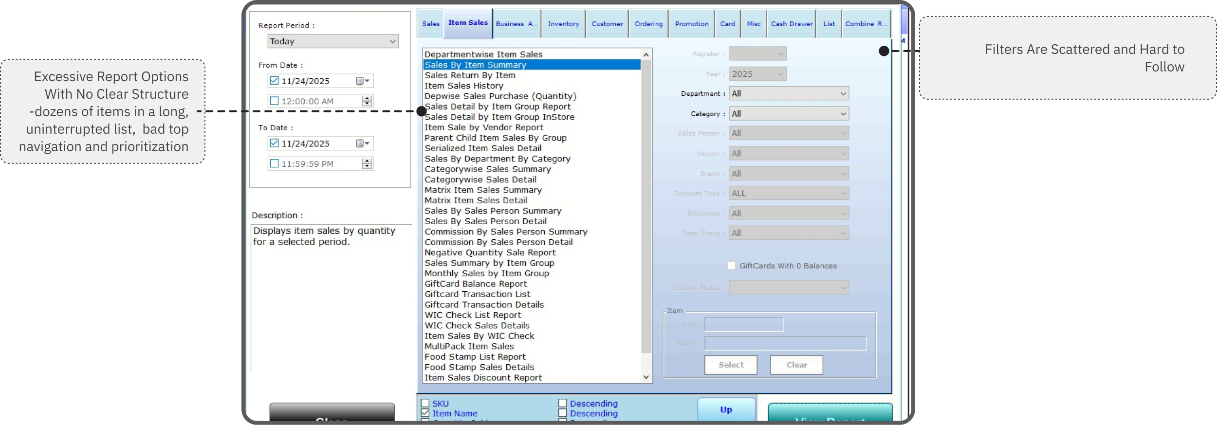
PROJECT CONTEXT

Objective
An AI-powered POS assistant designed to help restaurant staff manage orders, inventory, and customer service seamlessly acting as a thought partner rather than just another tool.

Why This Matters
The store operates on razor-thin margins, with staff turnover rates exceeding 70% annually. Every minute spent fumbling with technology is a minute not spent creating memorable guest experiences. But here's what most people miss: the problem isn't that staff need faster buttons they need better thinking support during high-pressure moments.
The Discovery Process
I positioned myself as a user inside the system, asking:
“Where does the data come from? Who needs it? And why does it feel so hard to use?”
- What I noticed:
Staff frequently interrupted each other with basic questions, managers spent significant time on repetitive inquiries and checking inventory across multiple systems, and new hires required 3-4 weeks of heavy mentorship to become confident.
Key Insight
Admin, Staff and managers weren't struggling with the POS system itself they were struggling with accessing the knowledge they needed to make good decisions quickly.
MAJORLY I FOCUSED ON
Immersing in the Admin Workflow
Mapping tasks, reports, filtering, legacy screens, and inconsistent data flows with no clear starting point.
Studying the Store Manager Side
How data moves from store to admin database, delays, missing fields, accuracy issues
Reviewing Existing Dashboards & Competitor Tools
What tools offer features but lack clarity, show numbers without meaning
-how I began
EXPLORING THE SOLUTION SPACE FOR AI
I explored Three options before landing on AI:
Option 1: Better information architecture
Reorganize menus, add search functionality, create shortcuts
Why it wasn't enough: Still requires staff to know what to look for and where to find it
Option 2: Comprehensive training program
Detailed onboarding, reference materials, cheat sheets
Why it wasn't enough: Doesn't help in real-time moments of need; information becomes outdated
Option 3: AI-powered conversational assistant
Natural language queries, contextual suggestions, proactive support
Why this made sense: Meets staff where they are, adapts to their language, provides answers in context
Why I Chose Option 3 (The Research Behind It)
Cognitive Load Theory
Based on: John Sweller's Cognitive Load Theory (1988)
Staff can only retain 5-7 pieces of information at once. Conversational AI reduces cognitive load by providing answers on demand.
Just-In-Time Learning
Inspired by: Xerox's Just-In-Time training approach
People learn best when they need the information RIGHT NOW, not 3 weeks ago in training. AI delivers knowledge exactly when decisions need to be made.
Contextual Intelligence
Research: Contextual design by Karen Holtzblatt
AI understands context (what the staff member is doing, what customer is asking) and surfaces relevant information without making them dig for it.
Aspect
Real-time Support
Reduces Interruptions
Contextual (understands situation)
Adapts to Staff Language
Works for High-Pressure Moments
Scales with Team Growth
Better UI
Manual search needed
Still interrupt supervisors
Shows all options equally
Need to integrate
Too slow under stress
Same training needed
Training
Requires recall
Still forget things
Dense + overwhelming
Need to learn
Forget under pressure
3+ weeks per person
AI Assistant
Instant answers
Self-sufficient
22% easier to interpret
Just ask naturally
Easy guide
Infinite scale
STORYBOARD: A DAY IN THE STORE FOR STAFF/MANAGER
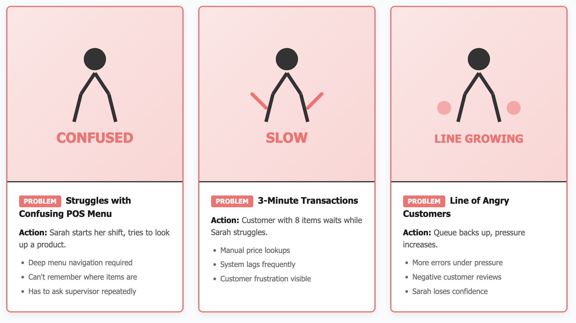
Persona 1: Retail Cashier
Current Problems
Confusing UI - Complex menu system, hard to find products
Long Learning Curve - New staff takes 2+ weeks to feel confident
Slow Transactions - Takes 3-4 minutes per customer
High Error Rates - Wrong prices, missed items, payment failures
Customer Frustration - Impatient customers, complaints, poor reviews
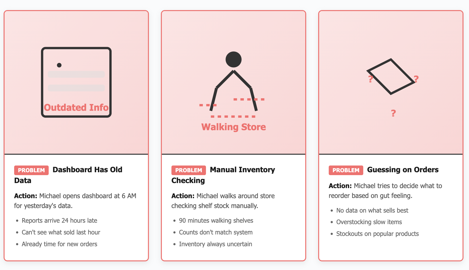
Persona 2: Store Manager
Current Problems
No Real-Time Data - Dashboard outdated, reports come 24 hours late
Manual Inventory Checks - Walking around store checking shelves physically
Guessing on Orders - No clear insights on what to reorder, excess stock or stockouts
No Analytics - Can't see which products sell best, staff performance unclear
Time Wasted - Spends 3+ hours daily on manual tasks instead of strategy
Defining AI Design Principles
Before designing any interface, I established principles based on what makes AI feel helpful rather than intrusive:
1. Feel Like a Partner, Not a Black Box
- Users should understand why AI suggests what it suggests
- Transparency in decision-making builds trust
- Application: Show confidence levels, explain reasoning, allow users to see the "why"
2. Humanize the Experience
- Conversational, not robotic
- Acknowledges uncertainty rather than faking confidence
- Application: Natural language processing, empathetic responses, admits when it doesn't know
3. Focus on Tasks That Unlock New Outcomes
- AI shouldn't just speed up existing processes—it should enable entirely new capabilities
- Application: Proactive insights (inventory running low), predictive suggestions (popular pairings), learning from patterns
4. Communicate Predictable Behavior
- Users should know what AI can and can't do
- Consistent interaction patterns build confidence
- Application: Clear capabilities, consistent response formats, explicit limitations
5. Build User Trust and Control
- Users always have final say
- Easy to override or ignore AI suggestions
- Application: Suggestions, not commands; one-tap to dismiss; manual controls always available
-the good mess
THE BRAINSTORMING PROCESS: FINDING THE EDGE CASES
How I Approached Ideation:
I didn't start with screens, I started with scenarios. Using the principle that AI should be a thought partner, I mapped out every moment a staff member might need support.
Scenarios explored:
- Server taking an order with specific preferences
- Customer asked for wine pairing recommendation
- Staff noticing ingredient running low
- New employee's first day on the floor
- Manager reviewing end-of-day analytics
- System encountering an item not in the database
Testing the Limits: Edge Cases That Shaped the Design
From Concepts to Prototypes
Early Prototyping Philosophy:
Following the principle of "prototyping as a tool for adding depth," I created multiple fidelity levels to test different aspects:

-the solution
THE SYSTEM BEYOND THE UI
DEFINING WHAT I BUILT
Key areas which I an showing the study on
Reports
Dynamic and AI-summarized, replacing manual PDF exports.
Analytics Dashboard
Visualized sales, restocks, and top sellers across stores.
Data Flow System
Created transparent visibility from store transactions to the admin database, ensuring real-time sync.
//USER PERSONA FOR EACH TYPE OF SYSTEM USER
//USER JOURNEY MAPPING FOR EACH TYPE OF SYSTEM USER
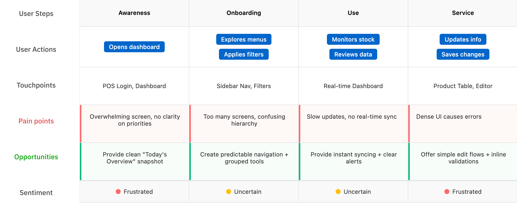
-wire framing and finalizing design decisions
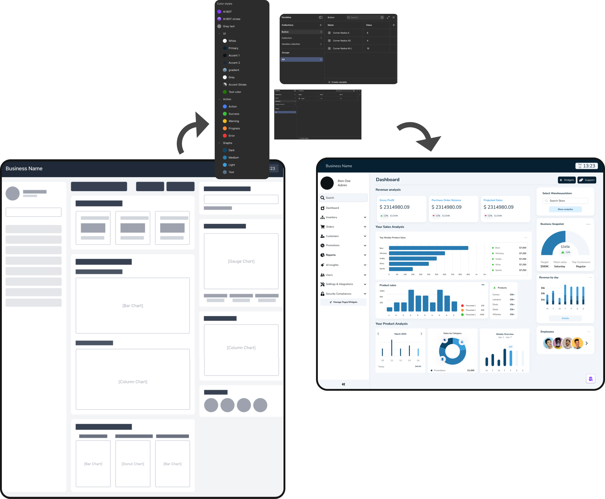
BUILDING THE LAYOUTS
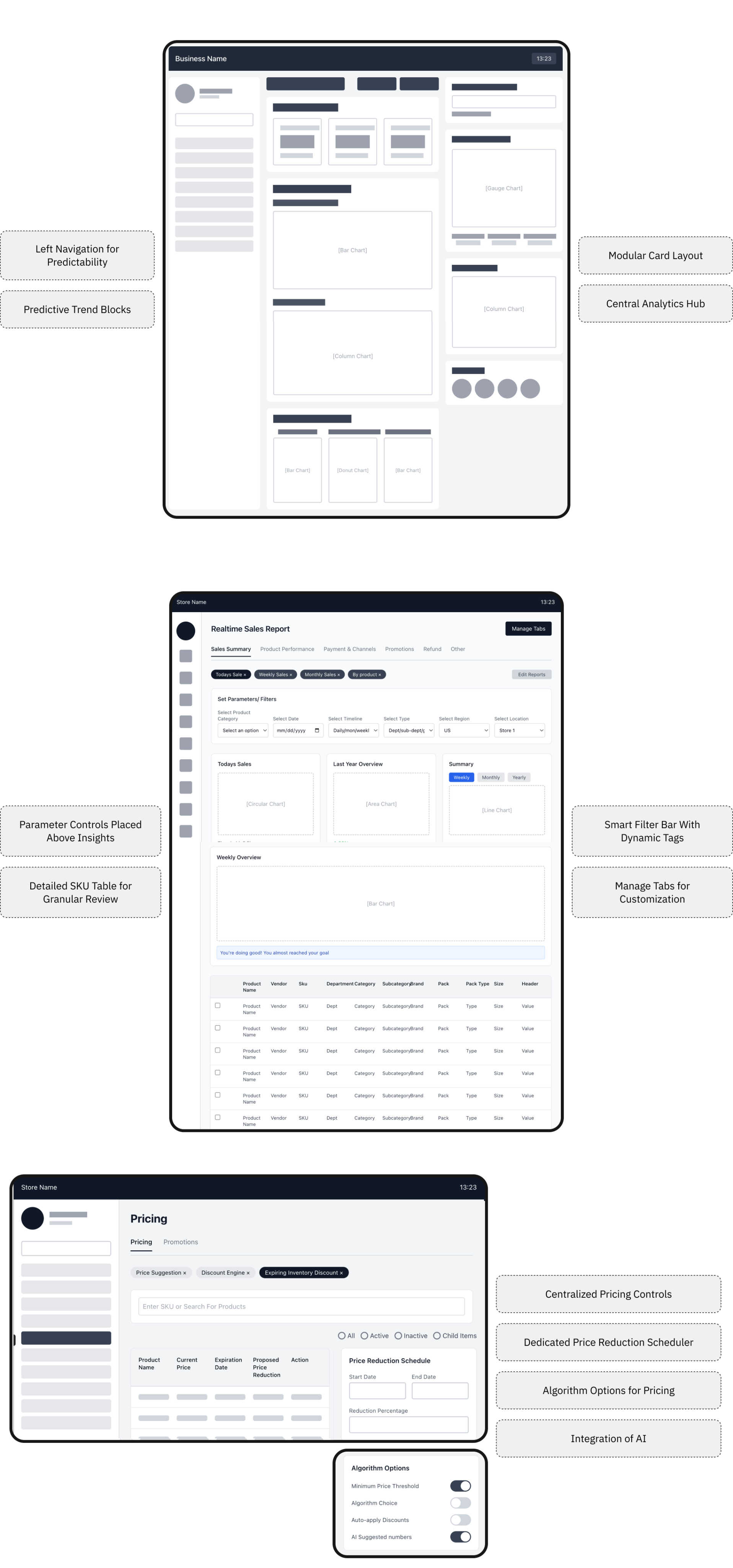
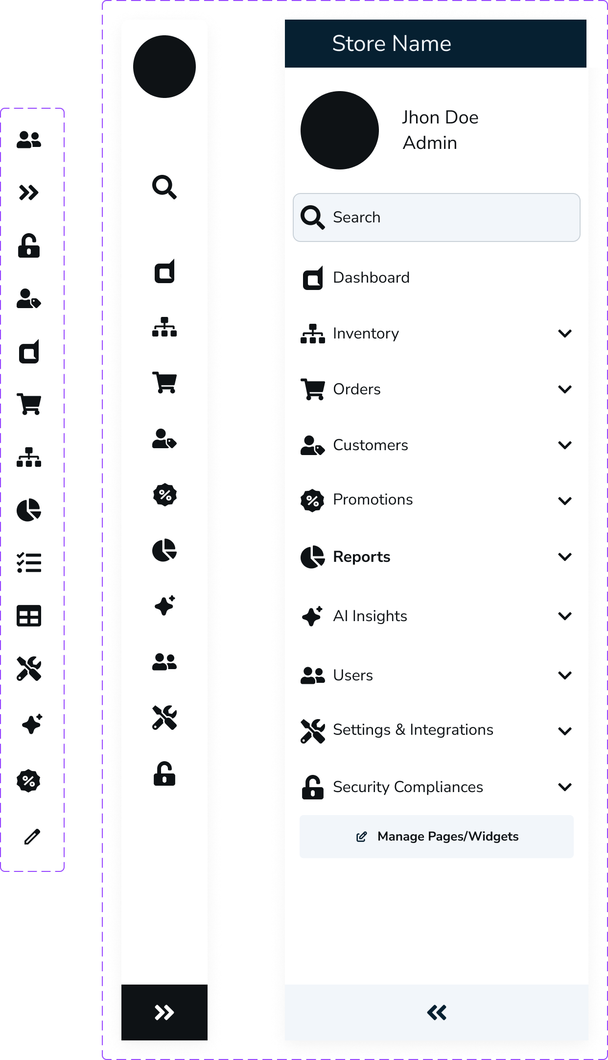
Left Navigation for Predictability
Predictive Trend Blocks
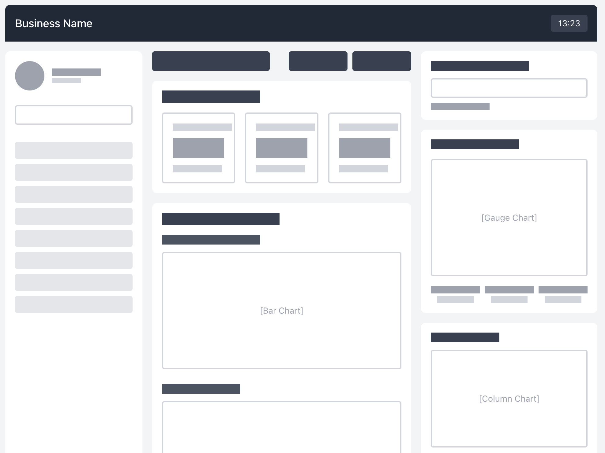
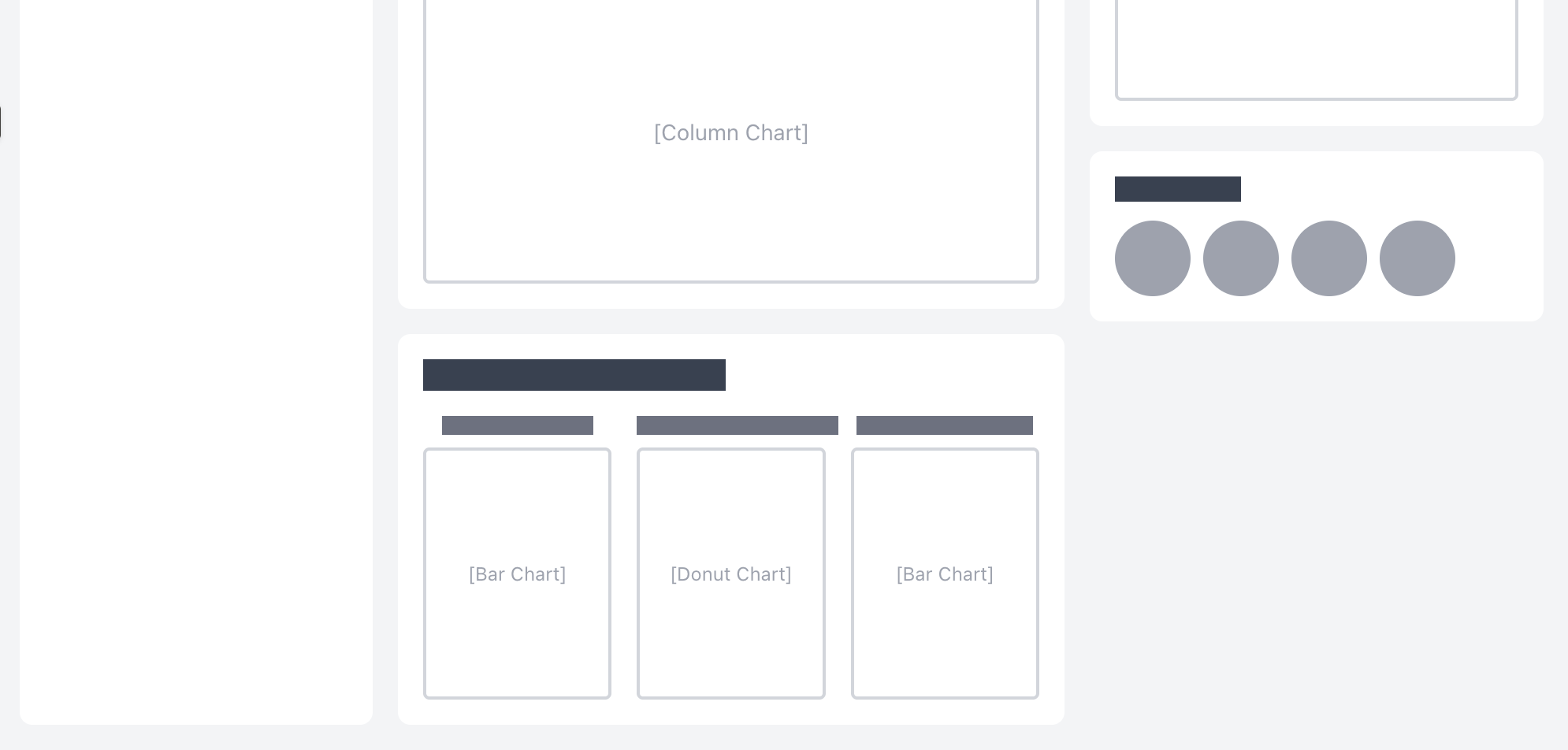
Modular Card Layout
Central Analytics Hub
Parameter Controls Placed Above Insights
Detailed SKU Table for Granular Review
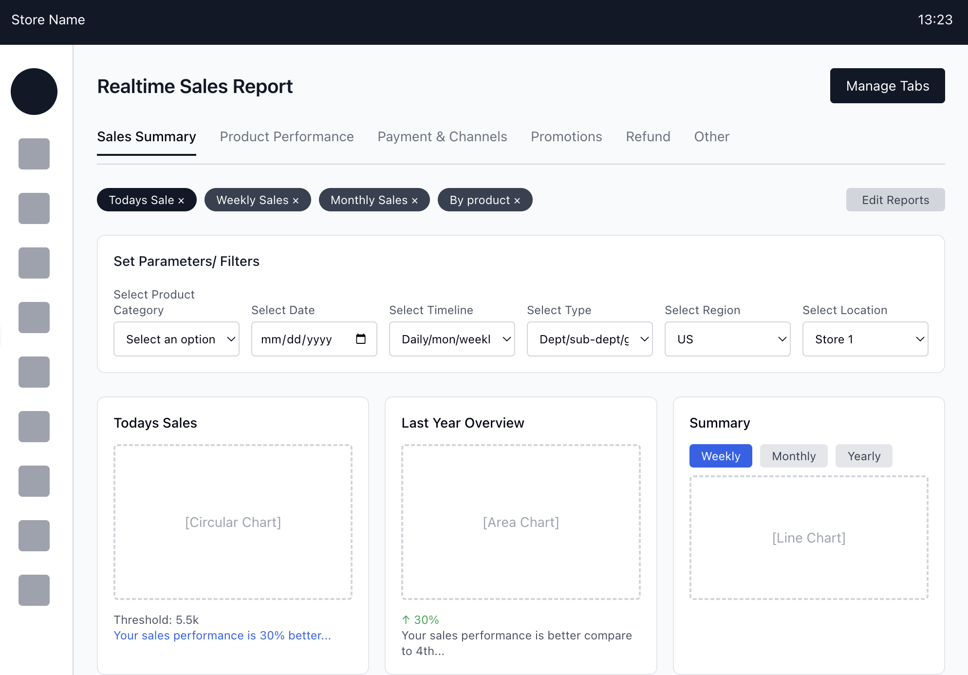
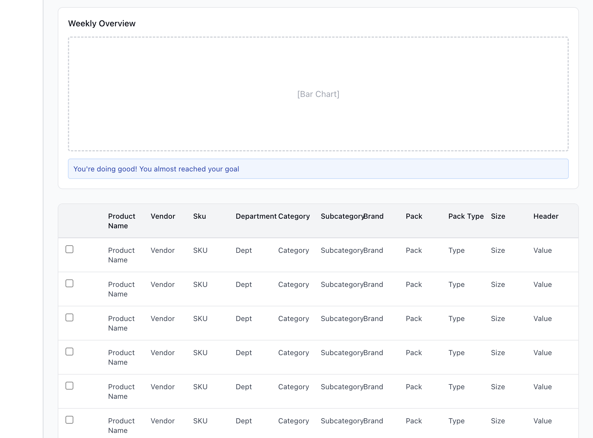
Smart Filter Bar With Dynamic Tags
Manage Tabs for Customization
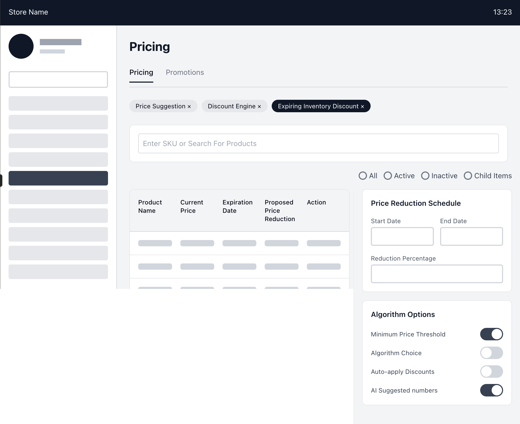
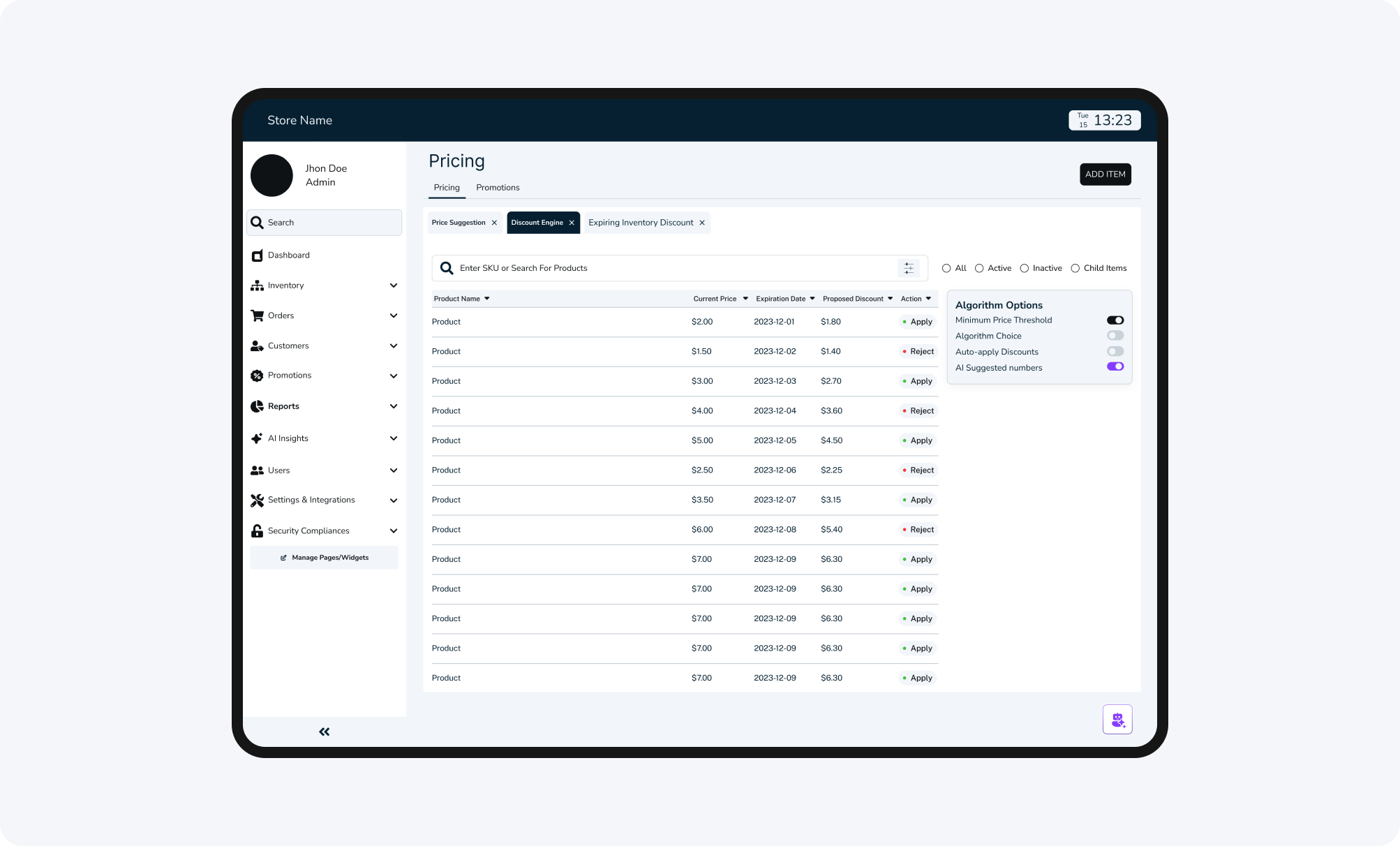
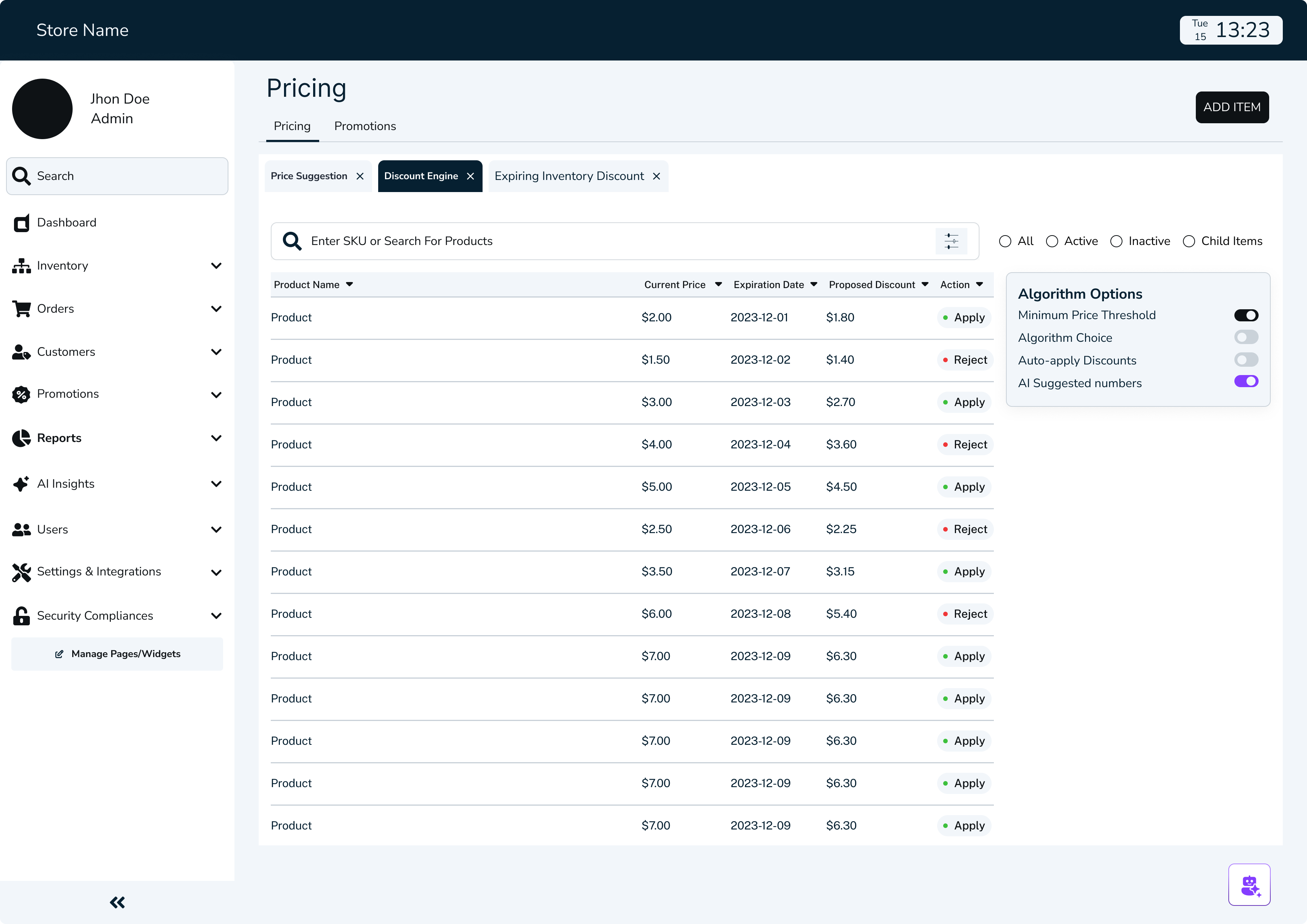
Centralized Pricing Controls
Dedicated Price Reduction Scheduler
Algorithm Options for Pricing
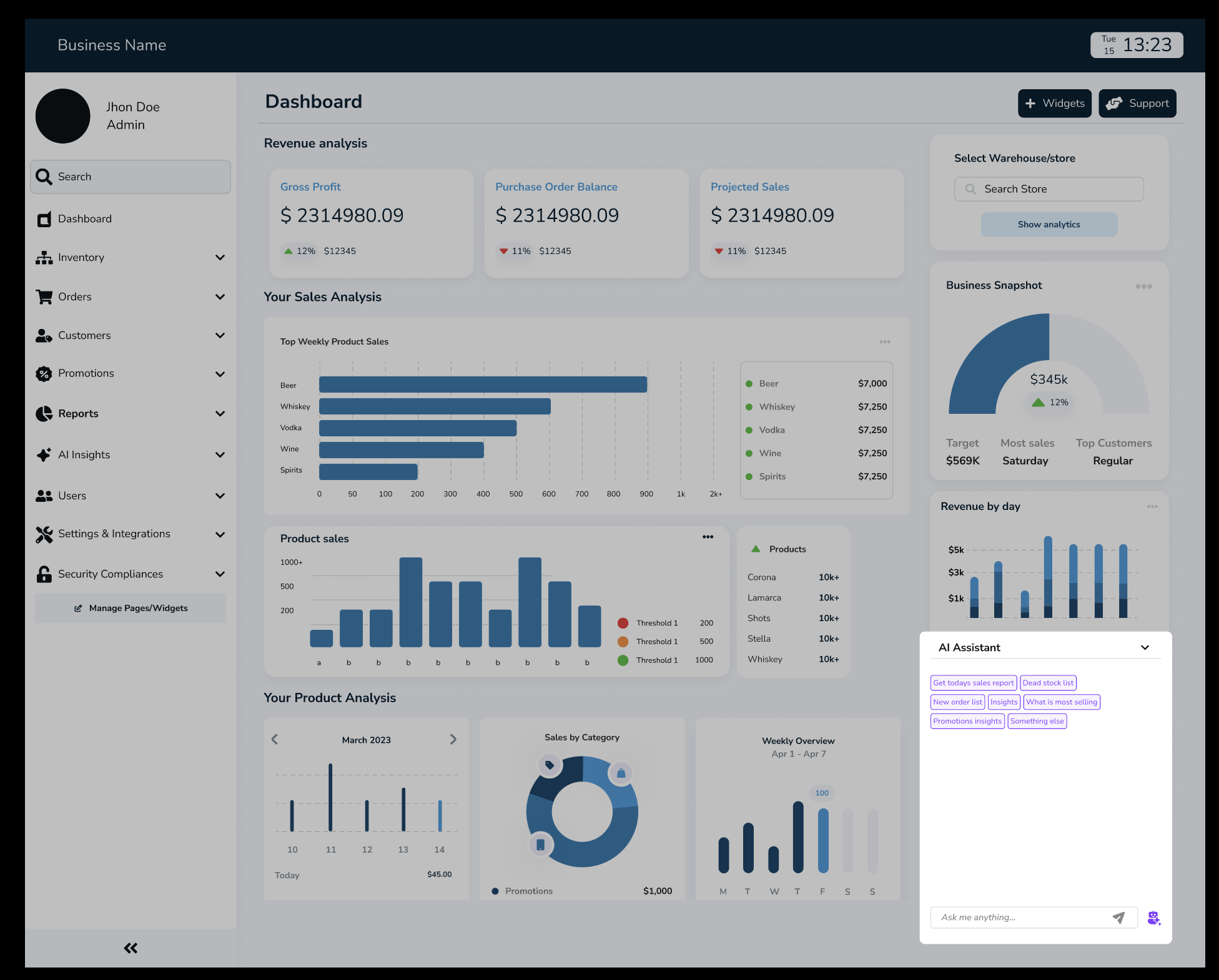
Integration of AI
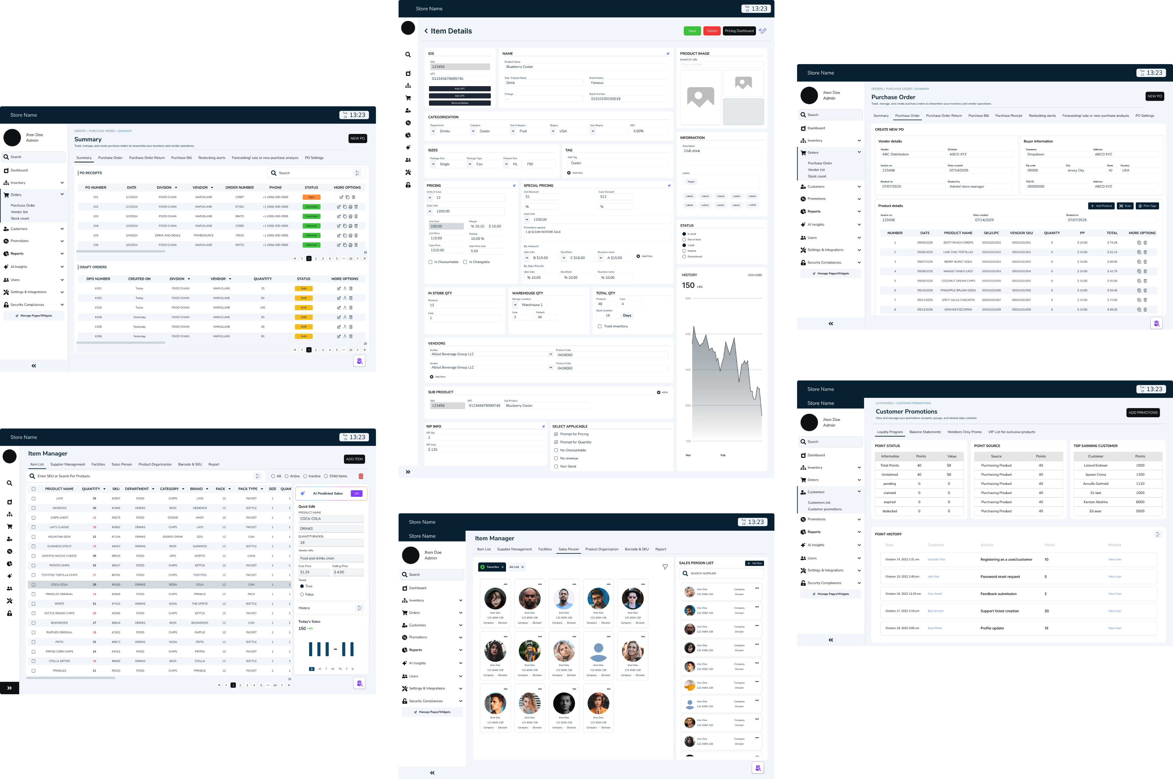
//WIREFRAMES
SYSTEM THINKING
//POS MIND MAP
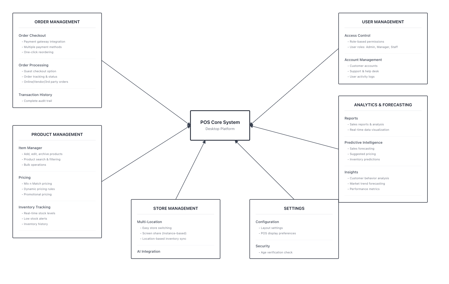
//SITEMAP
NOTES THAT HAD GREATER IMPACT TOWARDS THE FINAL OUTCOME
- identifying the problems
Complicated dashboards, slowed daily task
No real-time insights
Difficult to forecast demand
Manual restocking and price adjustments
No standardized multi-store reporting,
- noting out solutions
simplified dashboard that surfaces the important data
Real-Time Sales & Inventory Sync
AI- driven insights for restocking and reporting
AI-powered recommendation pricing strategies
Multi-store consolidated reporting
TRANSLATING INSIGHTS INTO RESULTS
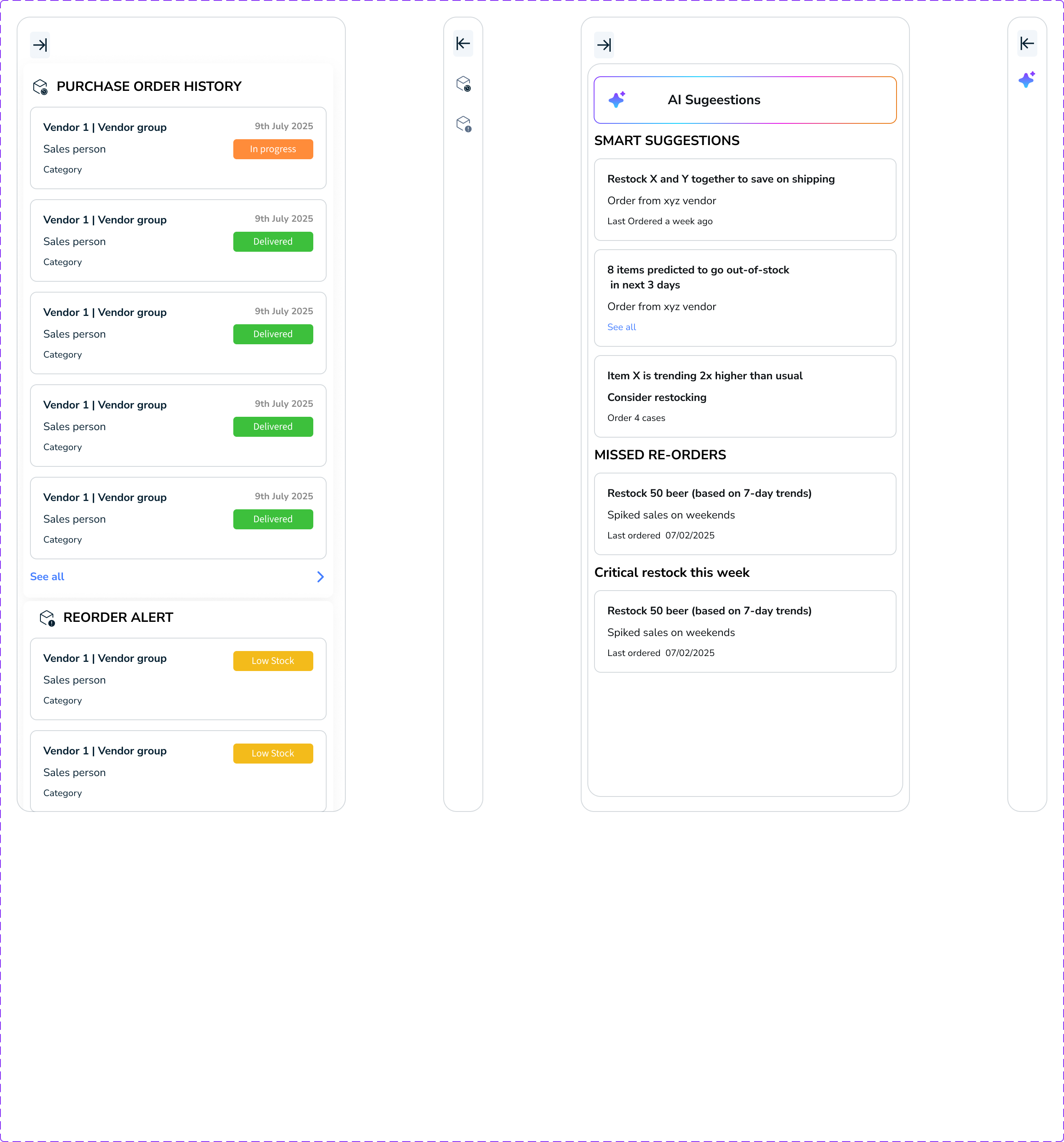
Smart Restock Predictions
AI tracked item velocity and forecasted when to reorder.
Important Narratives
Each report ended with an AI summary like “Chips sales up 12% due to weekend promotions.”
Admin Alerts
Automatic notifications about anomalies, like unexpected stock dips or licensing deadlines.
Final design outcome
Delivered a unified payment hub that removed repetitive navigation, reduced friction, and made every transaction faster, clearer, and more intuitive.
MEASURING THE IMPROVEMENT
I asked participants (admin + store manager personas) to complete the same 5 tasks
The same tets were alloted on work on the current POS systems and the new designed POS system
- Generate today’s sales report with the report section.
- Check weekly performance and revenue
- Add one item and update it in the inventory
- Identify a low-stock items with stores with AI
- Update the promotional pricing for a product
BEFORE AFTER COMPARISON TABLE

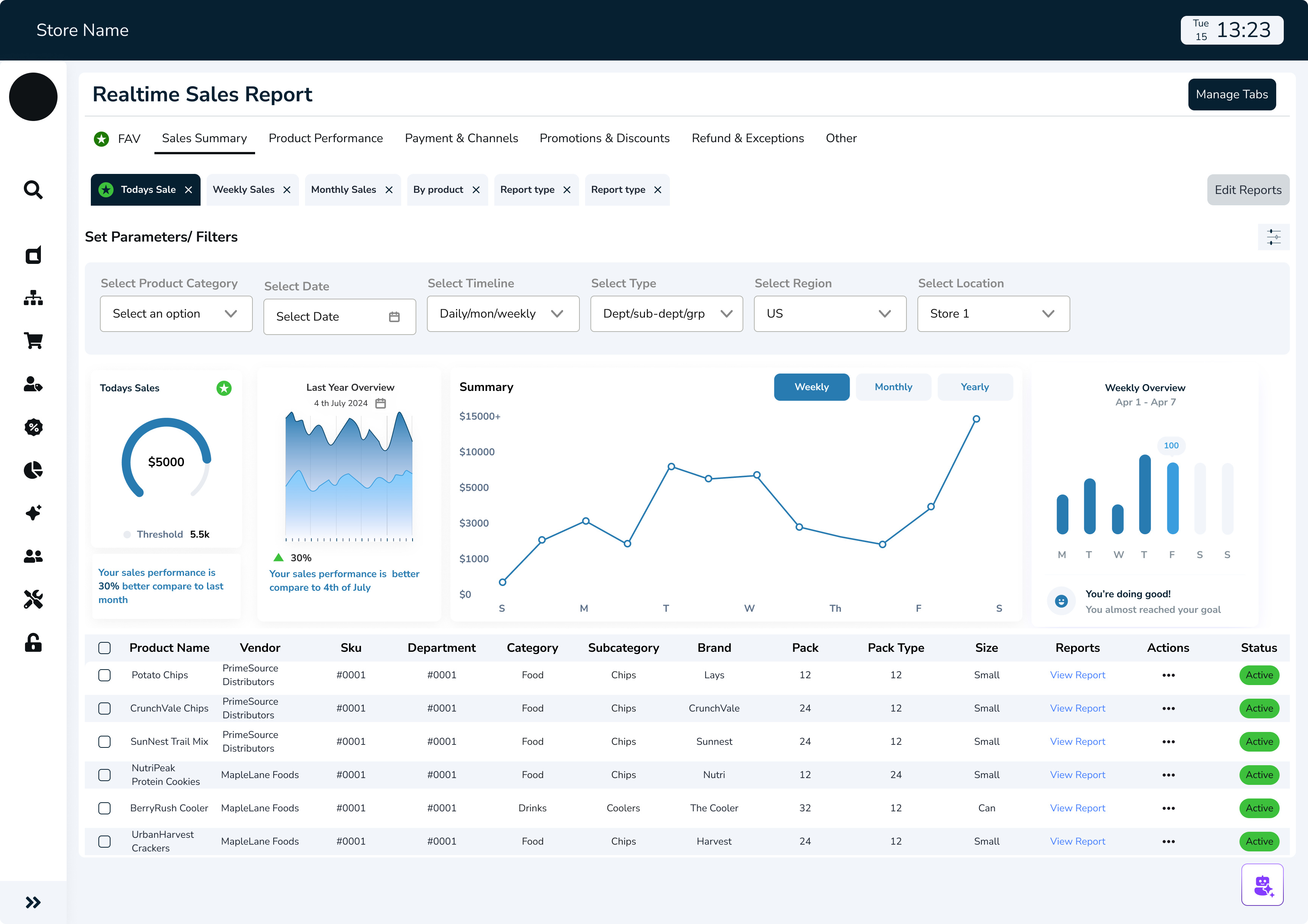
//POS DASHBOARD FOR EVERYDAY ANALYTICS
Design tokens



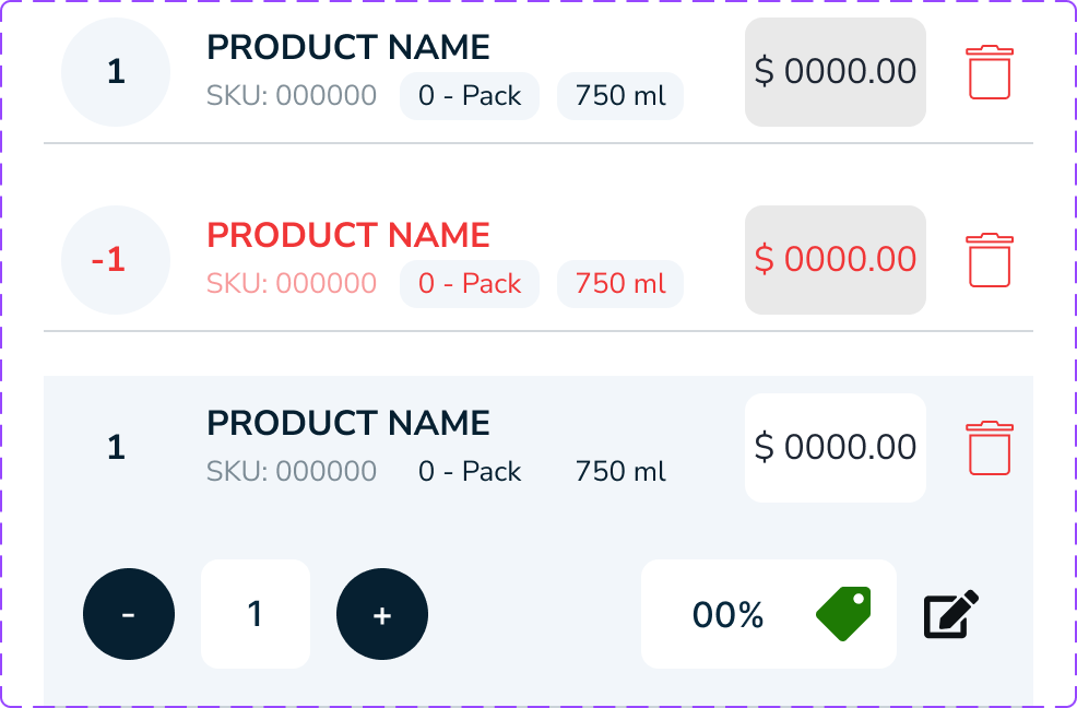
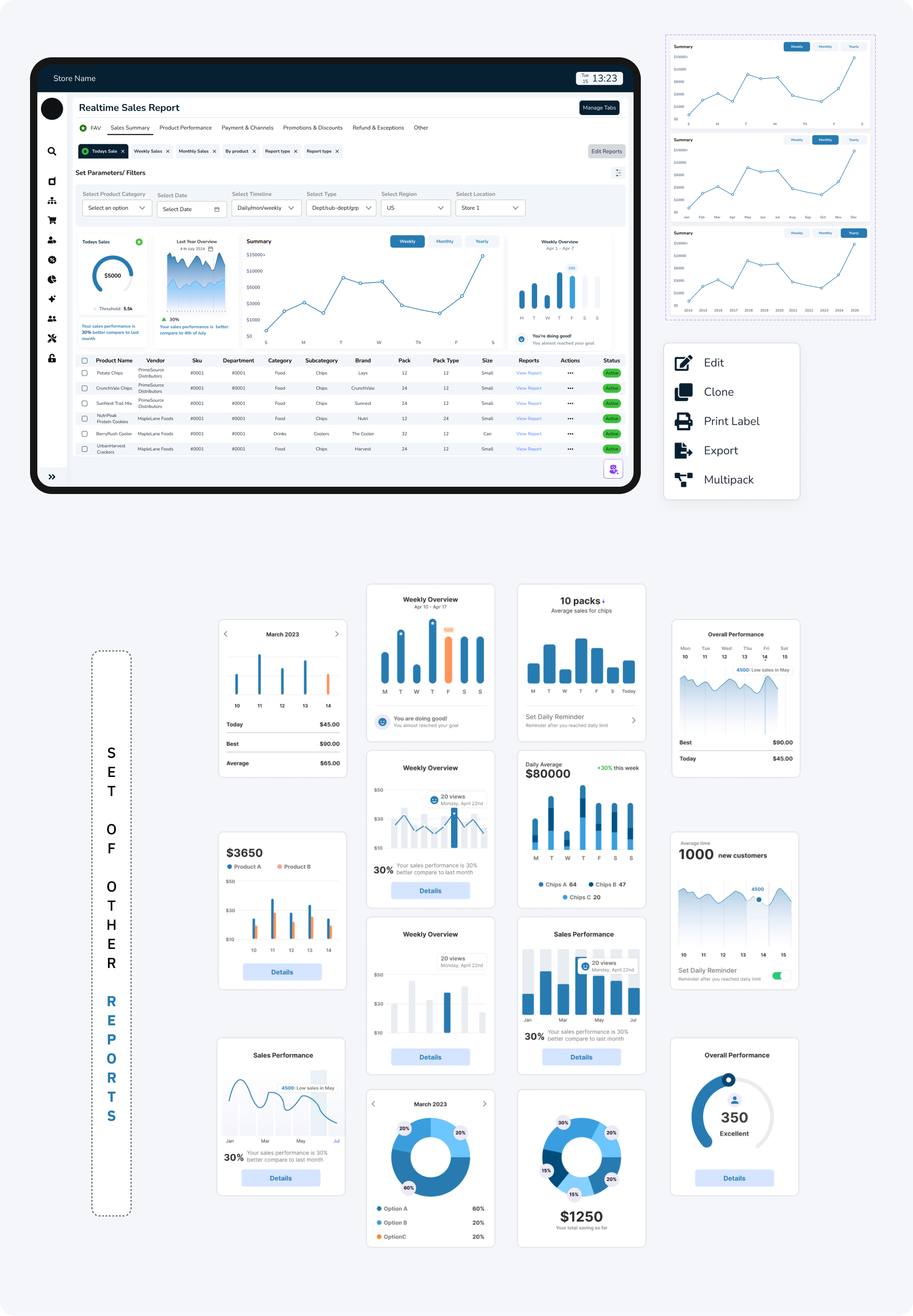
//THE MOST IMPORTANT THAT DRIVES THE BUSINESS- REPORTS
//CUSTOMIZABLE SETTINGS FOR INVENTORY PRICING
- the numbers that defined success
FINAL RESULT
32% Faster Reporting
Reporting time was reduced allowing teams to access insights instantly instead of navigating multiple disconnected tools.
15% Faster Task Completion
Clearer navigation, simplified dashboards, and visual summaries reduced the steps needed to complete daily tasks — making workflows smoother and more intuitive.
22% Reduction in Cognitive Load
The redesigned dashboard minimized clutter and turned dense information into digestible insights, helping admin users process data without overwhelm.
WHAT WOULD I DO DIFFERENTLY WITH EXTRA TIME
Deeper staff, manager and admin collaboration
- What I'd do: Embed in restaurants for full shifts, not just observations
- Why: Would catch micro-moments of friction I missed in shorter sessions
- Impact: More nuanced understanding of stress triggers and flow states
Long-Term Learning Study
- What I'd do: Deploy for 3-6 months and track how AI accuracy improves
- Why: Real learning patterns only emerge over time with real data
- Impact: Proof of value; insights for training improvements
Accessibility Deep Dive
- What I'd do: Test with staff who have visual, hearing, or motor impairments
- Why: Restaurant industry is diverse; technology should be inclusive
- Impact: More universally usable design
Integration Stress Testing
- What I'd do: Prototype the full technical architecture with developers
- Why: AI response speed under load is critical; beautiful UI means nothing if it's slow
- Impact: Realistic expectations and technical constraints surfaced early
- always a learner
KEY TAKEAWAY AND LEARNINGS
AI Should Assist, Not Replace
Transparency mattered more than complexity. Showing why an AI insight appeared built trust and usability.
Design for Flow, Not Features
Instead of adding more tools, I focused on connecting the existing ones and working on the functionality first rather than the design creating a seamless loop between admin data and the store manager’s cache.
Data Should Speak
I learned that analytics design is storytelling. Meaningful visuals transformed raw data into confident actions.
Browse more work


Trust & Security
Designed Security Flow: Smart ID at Shoptaki, boosting usability by 15% and creating engaging interfaces, creating seamless flow
Finance Multipayment hub
Revamped SmartID’s Finance Flow to streamline multi-payment actions, reducing steps by 40% and improving user control across transactions.

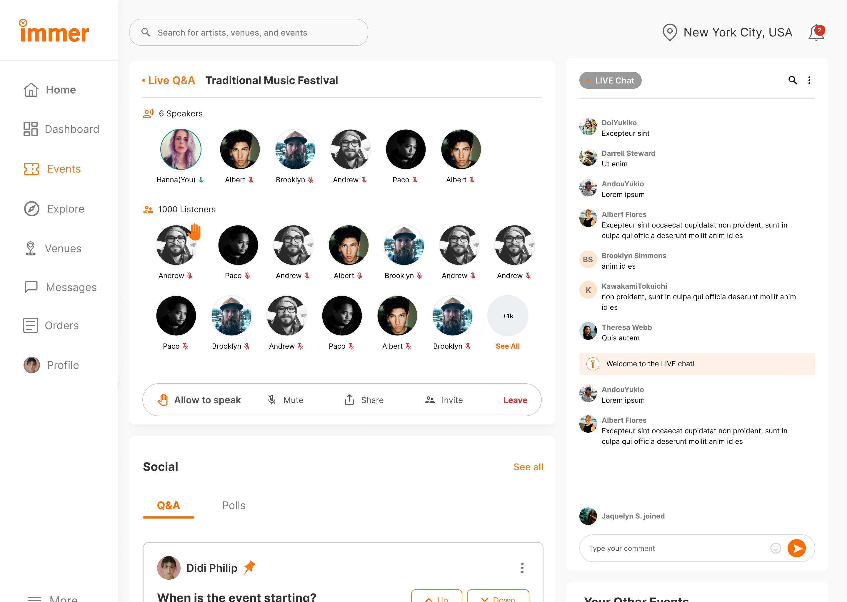
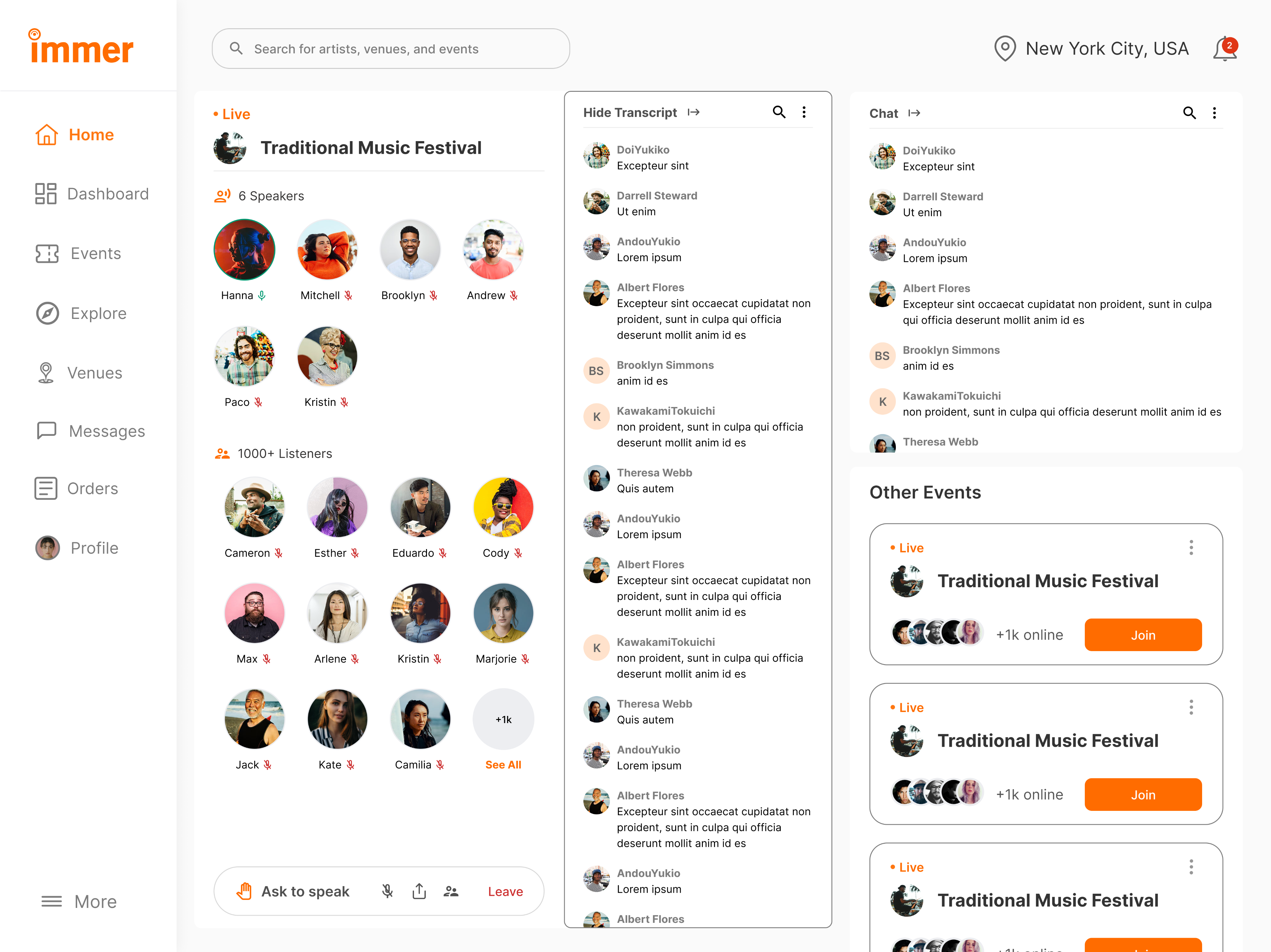
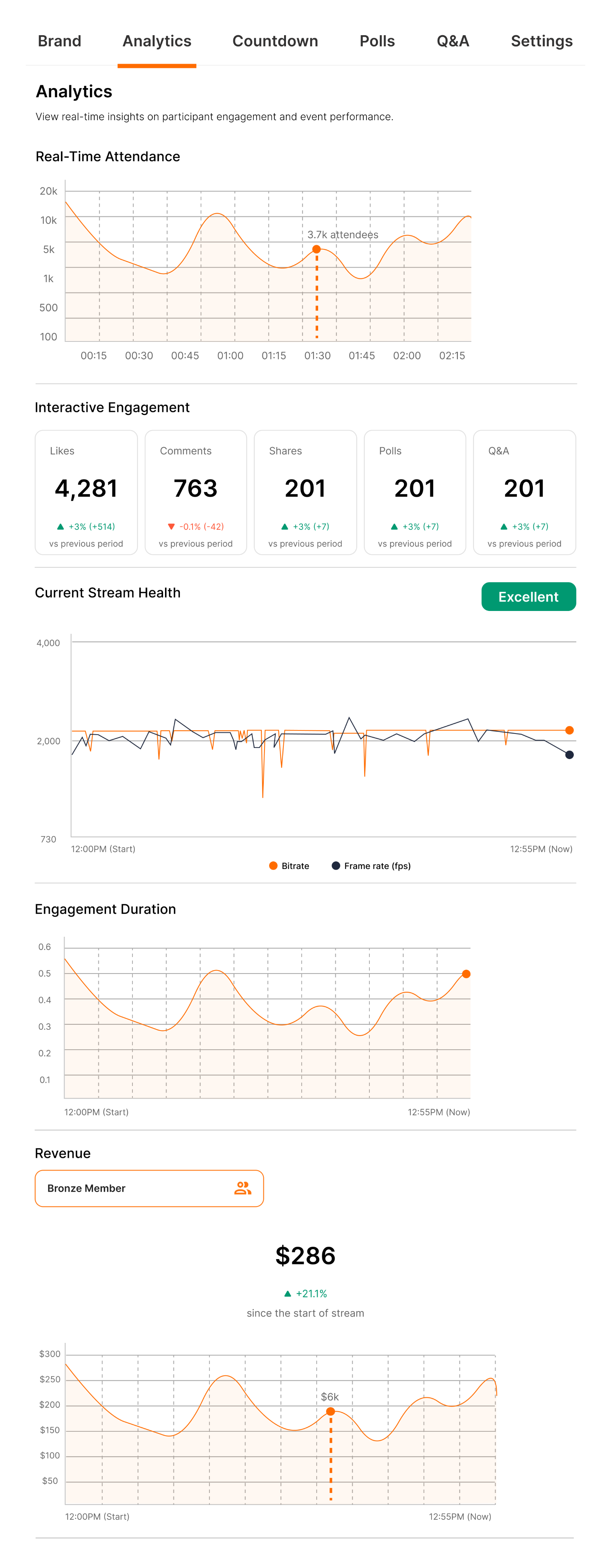
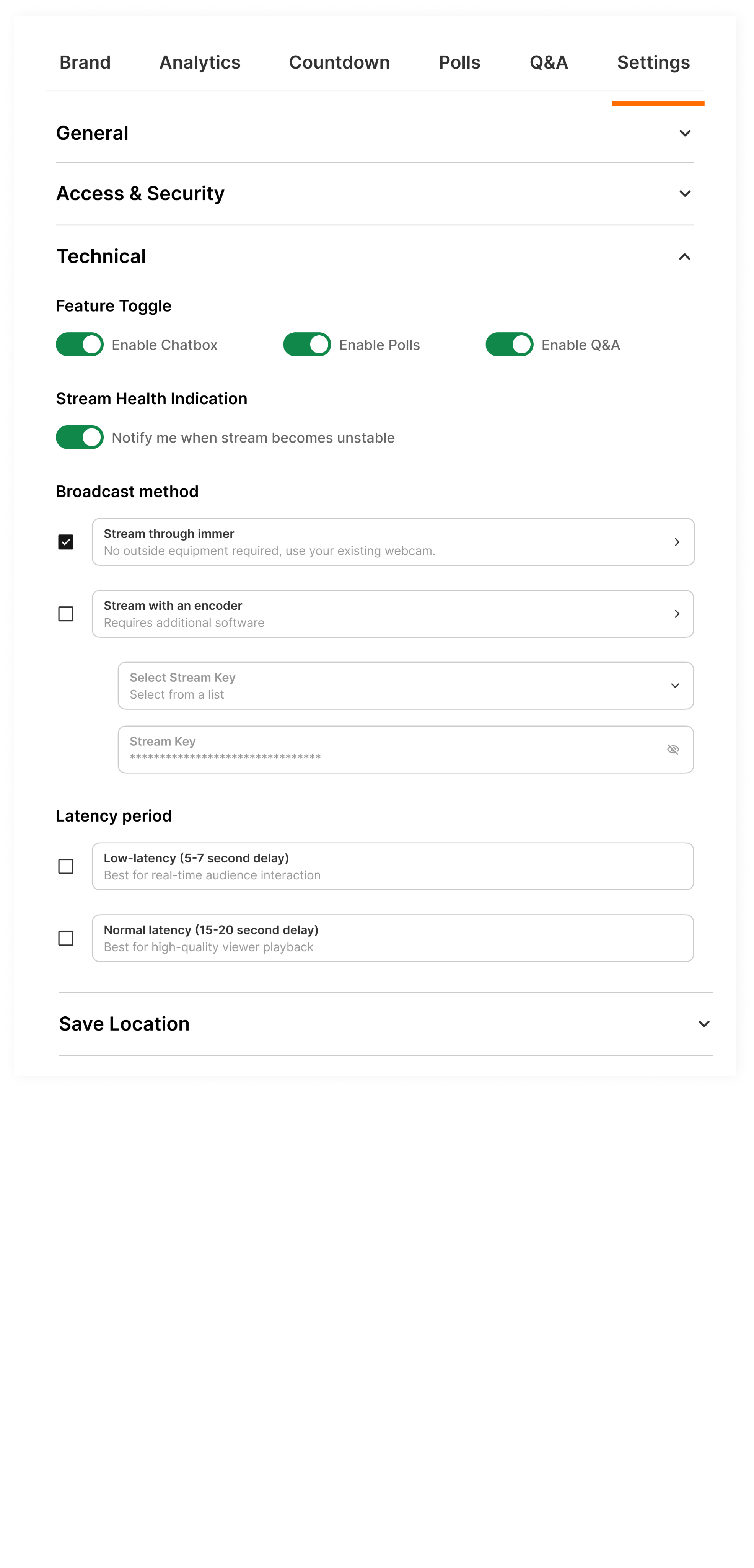
Live Audio Chat & Real-Time Engagement
Researched and redesigned the organizer experience for an event services and ticketing app, improving user flows, incerasing user engagement by 22%, and enhancing usability testing.
Designing an AI-powered POS System for Smarter Store Management
Designed an intelligent POS dashboard that unified orders, analytics, and AI insights helping store owners turn data into effortless business clarity.


MY ROLE
Product Designer
TIMELINE
4 Sprints | Product Cycle
TEAM
Sole designer, 1 Product Lead, 1 Full stack developer
PROBLEM
Existing POS system used disconnected tools for orders, inventory, and reporting, creating inconsistent workflows and scattered insights. Admins lacked real-time data visibility, slowing decisions and increasing manual work.
OUTCOME
Redesigned the POS experience with a unified, insight-driven dashboard featuring real-time analytics, clearer data flows between admin and manager roles, and AI-assisted summaries that transformed raw numbers into actionable guidance, making daily operations faster and easier to navigate.
Let's preview the final solution before going through the steps
Admin dashboard

Reports analytics

Adding new inventory

WHAT WAS BROKEN: OLD POS SYSTEM


PROJECT CONTEXT

Objective
An AI-powered POS assistant designed to help restaurant staff manage orders, inventory, and customer service seamlessly acting as a thought partner rather than just another tool.

Why This Matters
The store operates on razor-thin margins, with staff turnover rates exceeding 70% annually. Every minute spent fumbling with technology is a minute not spent creating memorable guest experiences. But here's what most people miss: the problem isn't that staff need faster buttons they need better thinking support during high-pressure moments.
The Discovery Process
I positioned myself as a user inside the system, asking:
“Where does the data come from? Who needs it? And why does it feel so hard to use?”
- What I noticed:
Staff frequently interrupted each other with basic questions, managers spent significant time on repetitive inquiries and checking inventory across multiple systems, and new hires required 3-4 weeks of heavy mentorship to become confident.
Key Insight
Admin, Staff and managers weren't struggling with the POS system itself they were struggling with accessing the knowledge they needed to make good decisions quickly.
MAJORLY I FOCUSED ON
Immersing in the Admin Workflow
Mapping tasks, reports, filtering, legacy screens, and inconsistent data flows with no clear starting point.
Studying the Store Manager Side
How data moves from store to admin database, delays, missing fields, accuracy issues
Reviewing Existing Dashboards & Competitor Tools
What tools offer features but lack clarity, show numbers without meaning
-how I began
EXPLORING THE SOLUTION SPACE FOR AI
I explored Three options before landing on AI:
Option 1: Better information architecture
Reorganize menus, add search functionality, create shortcuts
Why it wasn't enough: Still requires staff to know what to look for and where to find it
Option 2: Comprehensive training program
Detailed onboarding, reference materials, cheat sheets
Why it wasn't enough: Doesn't help in real-time moments of need; information becomes outdated
Option 3: AI-powered conversational assistant
Natural language queries, contextual suggestions, proactive support
Why this made sense: Meets staff where they are, adapts to their language, provides answers in context
Why I Chose Option 3 (The Research Behind It)
Cognitive Load Theory
Based on: John Sweller's Cognitive Load Theory (1988)
Staff can only retain 5-7 pieces of information at once. Conversational AI reduces cognitive load by providing answers on demand.
Just-In-Time Learning
Inspired by: Xerox's Just-In-Time training approach
People learn best when they need the information RIGHT NOW, not 3 weeks ago in training. AI delivers knowledge exactly when decisions need to be made.
Contextual Intelligence
Research: Contextual design by Karen Holtzblatt
AI understands context (what the staff member is doing, what customer is asking) and surfaces relevant information without making them dig for it.

STORYBOARD: A DAY IN THE STORE FOR STAFF/MANAGER
Persona 1: Retail Cashier
Current Problems
Confusing UI - Complex menu system, hard to find products
Long Learning Curve - New staff takes 2+ weeks to feel confident
Slow Transactions - Takes 3-4 minutes per customer
High Error Rates - Wrong prices, missed items, payment failures
Customer Frustration - Impatient customers, complaints, poor reviews

Persona 2: Store Manager
Current Problems
No Real-Time Data - Dashboard outdated, reports come 24 hours late
Manual Inventory Checks - Walking around store checking shelves physically
Guessing on Orders - No clear insights on what to reorder, excess stock or stockouts
No Analytics - Can't see which products sell best, staff performance unclear
Time Wasted - Spends 3+ hours daily on manual tasks instead of strategy

Defining AI Design Principles
Before designing any interface, I established principles based on what makes AI feel helpful rather than intrusive:
1. Feel Like a Partner, Not a Black Box
- Users should understand why AI suggests what it suggests
- Transparency in decision-making builds trust
- Application: Show confidence levels, explain reasoning, allow users to see the "why"
2. Humanize the Experience
- Conversational, not robotic
- Acknowledges uncertainty rather than faking confidence
- Application: Natural language processing, empathetic responses, admits when it doesn't know
3. Focus on Tasks That Unlock New Outcomes
- AI shouldn't just speed up existing processes—it should enable entirely new capabilities
- Application: Proactive insights (inventory running low), predictive suggestions (popular pairings), learning from patterns
4. Communicate Predictable Behavior
- Users should know what AI can and can't do
- Consistent interaction patterns build confidence
- Application: Clear capabilities, consistent response formats, explicit limitations
5. Build User Trust and Control
- Users always have final say
- Easy to override or ignore AI suggestions
- Application: Suggestions, not commands; one-tap to dismiss; manual controls always available
-the good mess
THE BRAINSTORMING PROCESS: FINDING THE EDGE CASES
How I Approached Ideation:
I didn't start with screens, I started with scenarios. Using the principle that AI should be a thought partner, I mapped out every moment a staff member might need support.
Scenarios explored:
- Server taking an order with specific preferences
- Customer asked for wine pairing recommendation
- Staff noticing ingredient running low
- New employee's first day on the floor
- Manager reviewing end-of-day analytics
- System encountering an item not in the database
Testing the Limits: Edge Cases That Shaped the Design
From Concepts to Prototypes
Early Prototyping Philosophy:
Following the principle of "prototyping as a tool for adding depth," I created multiple fidelity levels to test different aspects:

-the solution
THE SYSTEM BEYOND THE UI
Learning and Improvement Systems
How the AI Gets Smarter
Staff feedback loop
Thumbs up/down on suggestions
Correction tracking
When staff override, system learns from the pattern
Usage analytics
Which questions are most common? Where does AI struggle?
Manager inputs
Seasonal menu changes, new policies, special events
DEFINING WHAT I BUILT
Key areas which I an showing the study on
Reports
Dynamic and AI-summarized, replacing manual PDF exports.
Analytics Dashboard
Visualized sales, restocks, and top sellers across stores.
Data Flow System
Created transparent visibility from store transactions to the admin database, ensuring real-time sync.
//USER PERSONA FOR EACH TYPE OF SYSTEM USER
//USER JOURNEY MAPPING FOR EACH TYPE OF SYSTEM USER

-wire framing and finalizing design decisions
BUILDING THE LAYOUTS
Left Navigation for Predictability
Predictive Trend Blocks


Modular Card Layout
Central Analytics Hub
Parameter Controls Placed Above Insights
Detailed SKU Table for Granular Review


Smart Filter Bar With Dynamic Tags
Manage Tabs for Customization

Centralized Pricing Controls
Dedicated Price Reduction Scheduler
Algorithm Options for Pricing
Integration of AI
//WIREFRAMES
SYSTEM THINKING
//POS MIND MAP

//SITEMAP
NOTES THAT HAD GREATER IMPACT TOWARDS THE FINAL OUTCOME
- identifying the problems
Complicated dashboards, slowed daily task
No real-time insights
Difficult to forecast demand
Manual restocking and price adjustments
No standardized multi-store reporting,
- noting out solutions
simplified dashboard that surfaces the important data
Real-Time Sales & Inventory Sync
AI- driven insights for restocking and reporting
AI-powered recommendation pricing strategies
Multi-store consolidated reporting
TRANSLATING INSIGHTS INTO RESULTS
Smart Restock Predictions
AI tracked item velocity and forecasted when to reorder.
Important Narratives
Each report ended with an AI summary like “Chips sales up 12% due to weekend promotions.”
Admin Alerts
Automatic notifications about anomalies, like unexpected stock dips or licensing deadlines.
Final design outcome
Delivered a unified payment hub that removed repetitive navigation, reduced friction, and made every transaction faster, clearer, and more intuitive.
MEASURING THE IMPROVEMENT
I asked participants (admin + store manager personas) to complete the same 5 tasks
The same tets were alloted on work on the current POS systems and the new designed POS system
- Generate today’s sales report with the report section.
- Check weekly performance and revenue
- Add one item and update it in the inventory
- Identify a low-stock items with stores with AI
- Update the promotional pricing for a product
BEFORE AFTER COMPARISON TABLE
Category
Reporting Time
Task Steps
Cognitive Load
Insights
Structure
Before
50–80s, hard to find
6–9 steps
Dense + overwhelming
No summaries
Scattered menus
After
32% faster with single hub
15% fewer steps
22% easier to interpret
AI-generated insights
Unified dashboard
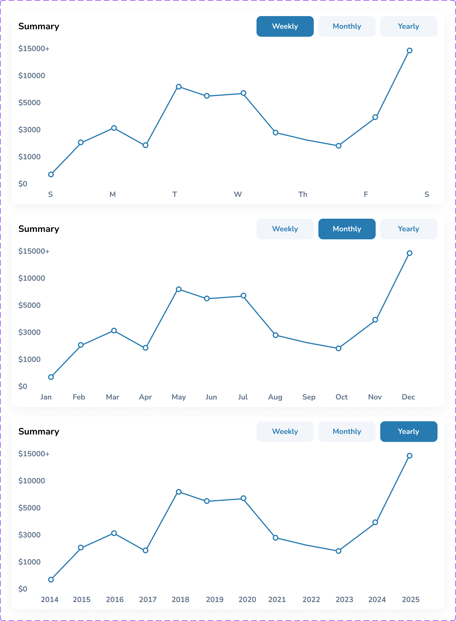
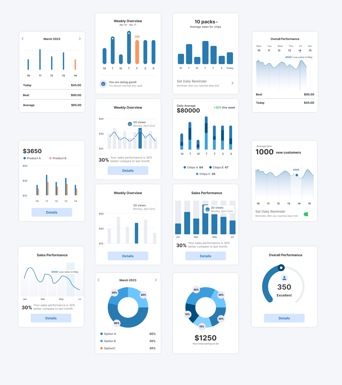
//POS DASHBOARD FOR EVERYDAY ANALYTICS
Design tokens


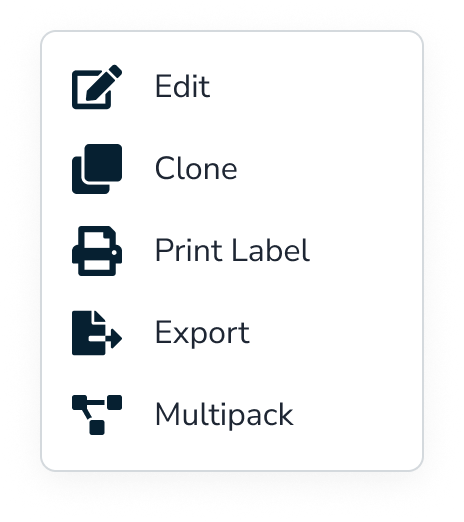
//THE MOST IMPORTANT THAT DRIVES THE BUSINESS- REPORTS
SET
OF
OTHER
REPORTS
//CUSTOMIZABLE SETTINGS FOR INVENTORY PRICING
- the numbers that defined success
FINAL RESULT
32% Faster Reporting
Reporting time was reduced allowing teams to access insights instantly instead of navigating multiple disconnected tools.
15% Faster Task Completion
Clearer navigation, simplified dashboards, and visual summaries reduced the steps needed to complete daily tasks — making workflows smoother and more intuitive.
22% Reduction in Cognitive Load
The redesigned dashboard minimized clutter and turned dense information into digestible insights, helping admin users process data without overwhelm.
WHAT WOULD I DO DIFFERENTLY WITH EXTRA TIME
Deeper staff, manager and admin collaboration
- What I'd do: Embed in restaurants for full shifts, not just observations
- Why: Would catch micro-moments of friction I missed in shorter sessions
- Impact: More nuanced understanding of stress triggers and flow states
Long-Term Learning Study
- What I'd do: Deploy for 3-6 months and track how AI accuracy improves
- Why: Real learning patterns only emerge over time with real data
- Impact: Proof of value; insights for training improvements
Accessibility Deep Dive
- What I'd do: Test with staff who have visual, hearing, or motor impairments
- Why: Restaurant industry is diverse; technology should be inclusive
- Impact: More universally usable design
Integration Stress Testing
- What I'd do: Prototype the full technical architecture with developers
- Why: AI response speed under load is critical; beautiful UI means nothing if it's slow
- Impact: Realistic expectations and technical constraints surfaced early
- always a learner
KEY TAKEAWAY AND LEARNINGS
AI Should Assist, Not Replace
Transparency mattered more than complexity. Showing why an AI insight appeared built trust and usability.
Design for Flow, Not Features
Instead of adding more tools, I focused on connecting the existing ones and working on the functionality first rather than the design creating a seamless loop between admin data and the store manager’s cache.
Data Should Speak
I learned that analytics design is storytelling. Meaningful visuals transformed raw data into confident actions.
Browse more work


Built Trust
Product Designer
User Research
B2B
SaaS
Most impactful
Trust & Security
Designed Security Flow: Smart ID at Shoptaki, boosting usability by 15% and creating engaging interfaces, creating seamless flow
Finance Multipayment hub
Revamped SmartID’s Finance Flow to streamline multi-payment actions, reducing steps by 40% and improving user control across transactions.

Built Emotion
UX/UI Design
User Research
B2C
SaaS
Entertainment service
Most impactful
Live Audio Chat & Real-Time Engagement
Researched and redesigned the organizer experience for an event services and ticketing app, improving user flows, incerasing user engagement by 22%, and enhancing usability testing.


OVERVIEW
PROJECT CONTEXT
Designing an AI-powered POS System for Smarter Store Management
Designed an intelligent POS dashboard that unified orders, analytics, and AI insights helping store owners turn data into effortless business clarity.


MY ROLE
Product Designer
TIMELINE
4 Sprints | Product Cycle
TEAM
Sole designer, 1 Product Lead, 1 Full stack developer
PROBLEM
Existing POS system used disconnected tools for orders, inventory, and reporting, creating inconsistent workflows and scattered insights. Admins lacked real-time data visibility, slowing decisions and increasing manual work.
OUTCOME
Redesigned the POS experience with a unified, insight-driven dashboard featuring real-time analytics, clearer data flows between admin and manager roles, and AI-assisted summaries that transformed raw numbers into actionable guidance, making daily operations faster and easier to navigate.
Let's preview the final solution before going through the steps
Admin dashboard

Reports analytics

Adding new inventory

WHAT WAS BROKEN: OLD POS SYSTEM


PROJECT CONTEXT

Objective
An AI-powered POS assistant designed to help restaurant staff manage orders, inventory, and customer service seamlessly acting as a thought partner rather than just another tool.

Why This Matters
The store operates on razor-thin margins, with staff turnover rates exceeding 70% annually. Every minute spent fumbling with technology is a minute not spent creating memorable guest experiences. But here's what most people miss: the problem isn't that staff need faster buttons they need better thinking support during high-pressure moments.
The Discovery Process
I positioned myself as a user inside the system, asking:
“Where does the data come from? Who needs it? And why does it feel so hard to use?”
- What I noticed:
Staff frequently interrupted each other with basic questions, managers spent significant time on repetitive inquiries and checking inventory across multiple systems, and new hires required 3-4 weeks of heavy mentorship to become confident.
Key Insight
Admin, Staff and managers weren't struggling with the POS system itself they were struggling with accessing the knowledge they needed to make good decisions quickly.
MAJORLY I FOCUSED ON
Immersing in the Admin Workflow
Mapping tasks, reports, filtering, legacy screens, and inconsistent data flows with no clear starting point.
Studying the Store Manager Side
How data moves from store to admin database, delays, missing fields, accuracy issues
Reviewing Existing Dashboards & Competitor Tools
What tools offer features but lack clarity, show numbers without meaning
-how I began
EXPLORING THE SOLUTION SPACE FOR AI
I explored Three options before landing on AI:
Option 1: Better information architecture
Reorganize menus, add search functionality, create shortcuts
Why it wasn't enough: Still requires staff to know what to look for and where to find it
Option 2: Comprehensive training program
Detailed onboarding, reference materials, cheat sheets
Why it wasn't enough: Doesn't help in real-time moments of need; information becomes outdated
Option 3: AI-powered conversational assistant
Natural language queries, contextual suggestions, proactive support
Why this made sense: Meets staff where they are, adapts to their language, provides answers in context
Why I Chose Option 3 (The Research Behind It)
Cognitive Load Theory
Based on: John Sweller's Cognitive Load Theory (1988)
Staff can only retain 5-7 pieces of information at once. Conversational AI reduces cognitive load by providing answers on demand.
Just-In-Time Learning
Inspired by: Xerox's Just-In-Time training approach
People learn best when they need the information RIGHT NOW, not 3 weeks ago in training. AI delivers knowledge exactly when decisions need to be made.
Contextual Intelligence
Research: Contextual design by Karen Holtzblatt
AI understands context (what the staff member is doing, what customer is asking) and surfaces relevant information without making them dig for it.
Aspect
Real-time Support
Reduces Interruptions
Contextual (understands situation)
Adapts to Staff Language
Works for High-Pressure Moments
Scales with Team Growth
Better UI
Manual search needed
Still interrupt supervisors
Shows all options equally
Need to integrate
Too slow under stress
Same training needed
Training
Requires recall
Still forget things
Dense + overwhelming
Need to learn
Forget under pressure
3+ weeks per person
AI Assistant
Instant answers
Self-sufficient
22% easier to interpret
Just ask naturally
Easy guide
Infinite scale
STORYBOARD: A DAY IN THE STORE FOR STAFF/MANAGER
Persona 1: Retail Cashier
Current Problems
Confusing UI - Complex menu system, hard to find products
Long Learning Curve - New staff takes 2+ weeks to feel confident
Slow Transactions - Takes 3-4 minutes per customer
High Error Rates - Wrong prices, missed items, payment failures
Customer Frustration - Impatient customers, complaints, poor reviews

Persona 2: Store Manager
Current Problems
No Real-Time Data - Dashboard outdated, reports come 24 hours late
Manual Inventory Checks - Walking around store checking shelves physically
Guessing on Orders - No clear insights on what to reorder, excess stock or stockouts
No Analytics - Can't see which products sell best, staff performance unclear
Time Wasted - Spends 3+ hours daily on manual tasks instead of strategy

Defining AI Design Principles
Before designing any interface, I established principles based on what makes AI feel helpful rather than intrusive:
1. Feel Like a Partner, Not a Black Box
- Users should understand why AI suggests what it suggests
- Transparency in decision-making builds trust
- Application: Show confidence levels, explain reasoning, allow users to see the "why"
2. Humanize the Experience
- Conversational, not robotic
- Acknowledges uncertainty rather than faking confidence
- Application: Natural language processing, empathetic responses, admits when it doesn't know
3. Focus on Tasks That Unlock New Outcomes
- AI shouldn't just speed up existing processes—it should enable entirely new capabilities
- Application: Proactive insights (inventory running low), predictive suggestions (popular pairings), learning from patterns
4. Communicate Predictable Behavior
- Users should know what AI can and can't do
- Consistent interaction patterns build confidence
- Application: Clear capabilities, consistent response formats, explicit limitations
5. Build User Trust and Control
- Users always have final say
- Easy to override or ignore AI suggestions
- Application: Suggestions, not commands; one-tap to dismiss; manual controls always available
THE BRAINSTORMING PROCESS: FINDING THE EDGE CASES
How I Approached Ideation:
I didn't start with screens, I started with scenarios. Using the principle that AI should be a thought partner, I mapped out every moment a staff member might need support.
Scenarios explored:
- Server taking an order with specific preferences
- Customer asked for wine pairing recommendation
- Staff noticing ingredient running low
- New employee's first day on the floor
- Manager reviewing end-of-day analytics
- System encountering an item not in the database
Testing the Limits: Edge Cases That Shaped the Design
From Concepts to Prototypes
Early Prototyping Philosophy:
Following the principle of "prototyping as a tool for adding depth," I created multiple fidelity levels to test different aspects:

Learning and Improvement Systems
How the AI Gets Smarter
Staff feedback loop
Thumbs up/down on suggestions
Correction tracking
When staff override, system learns from the pattern
Usage analytics
Which questions are most common? Where does AI struggle?
Manager inputs
Seasonal menu changes, new policies, special events
DEFINING WHAT I BUILT
Key areas which I an showing the study on
Reports
Dynamic and AI-summarized, replacing manual PDF exports.
Analytics Dashboard
Visualized sales, restocks, and top sellers across stores.
Data Flow System
Created transparent visibility from store transactions to the admin database, ensuring real-time sync.
//USER PERSONA FOR EACH TYPE OF SYSTEM USER
//USER JOURNEY MAPPING FOR EACH TYPE OF SYSTEM USER

SYSTEM THINKING
//POS MIND MAP

//SITEMAP
NOTES THAT HAD GREATER IMPACT TOWARDS THE FINAL OUTCOME
- identifying the problems
Complicated dashboards, slowed daily task
No real-time insights
Difficult to forecast demand
Manual restocking and price adjustments
No standardized multi-store reporting,
- noting out solutions
simplified dashboard that surfaces the important data
Real-Time Sales & Inventory Sync
AI- driven insights for restocking and reporting
AI-powered recommendation pricing strategies
Multi-store consolidated reporting
-wire framing and finalizing design decisions
BUILDING THE LAYOUTS
Left Navigation for Predictability
Predictive Trend Blocks


Modular Card Layout
Central Analytics Hub
Parameter Controls Placed Above Insights
Detailed SKU Table for Granular Review


Smart Filter Bar With Dynamic Tags
Manage Tabs for Customization

Centralized Pricing Controls
Dedicated Price Reduction Scheduler
Algorithm Options for Pricing
Integration of AI
//WIREFRAMES
TRANSLATING INSIGHTS INTO RESULTS
Smart Restock Predictions
AI tracked item velocity and forecasted when to reorder.
Important Narratives
Each report ended with an AI summary like “Chips sales up 12% due to weekend promotions.”
Admin Alerts
Automatic notifications about anomalies, like unexpected stock dips or licensing deadlines.
Final design outcome
Delivered a unified payment hub that removed repetitive navigation, reduced friction, and made every transaction faster, clearer, and more intuitive.
MEASURING THE IMPROVEMENT
I asked participants (admin + store manager personas) to complete the same 5 tasks
The same tets were alloted on work on the current POS systems and the new designed POS system
- Generate today’s sales report with the report section.
- Check weekly performance and revenue
- Add one item and update it in the inventory
- Identify a low-stock items with stores with AI
- Update the promotional pricing for a product
BEFORE AFTER COMPARISON TABLE
Category
Reporting Time
Task Steps
Cognitive Load
Insights
Structure
Before
50–80s, hard to find
6–9 steps
Dense + overwhelming
No summaries
Scattered menus
After
32% faster with single hub
15% fewer steps
22% easier to interpret
AI-generated insights
Unified dashboard
//POS DASHBOARD FOR EVERYDAY ANALYTICS
Design tokens


//THE MOST IMPORTANT THAT DRIVES THE BUSINESS- REPORTS


SET
OF
OTHER
REPORTS

//CUSTOMIZABLE SETTINGS FOR INVENTORY PRICING

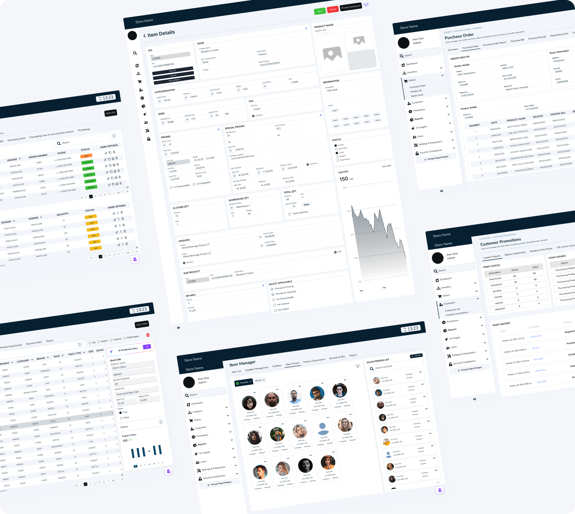
//MOCKUP

- the numbers that defined success
FINAL RESULT
32% Faster Reporting
Reporting time was reduced allowing teams to access insights instantly instead of navigating multiple disconnected tools.
15% Faster Task Completion
Clearer navigation, simplified dashboards, and visual summaries reduced the steps needed to complete daily tasks — making workflows smoother and more intuitive.
22% Reduction in Cognitive Load
The redesigned dashboard minimized clutter and turned dense information into digestible insights, helping admin users process data without overwhelm.
WHAT WOULD I DO DIFFERENTLY WITH EXTRA TIME
Deeper staff, manager and admin collaboration
- What I'd do: Embed in restaurants for full shifts, not just observations
- Why: Would catch micro-moments of friction I missed in shorter sessions
- Impact: More nuanced understanding of stress triggers and flow states
Long-Term Learning Study
- What I'd do: Deploy for 3-6 months and track how AI accuracy improves
- Why: Real learning patterns only emerge over time with real data
- Impact: Proof of value; insights for training improvements
Accessibility Deep Dive
- What I'd do: Test with staff who have visual, hearing, or motor impairments
- Why: Restaurant industry is diverse; technology should be inclusive
- Impact: More universally usable design
Integration Stress Testing
- What I'd do: Prototype the full technical architecture with developers
- Why: AI response speed under load is critical; beautiful UI means nothing if it's slow
- Impact: Realistic expectations and technical constraints surfaced early
- always a learner
KEY TAKEAWAY AND LEARNINGS
AI Should Assist, Not Replace
Transparency mattered more than complexity. Showing why an AI insight appeared built trust and usability.
Design for Flow, Not Features
Instead of adding more tools, I focused on connecting the existing ones and working on the functionality first rather than the design creating a seamless loop between admin data and the store manager’s cache.
Data Should Speak
I learned that analytics design is storytelling. Meaningful visuals transformed raw data into confident actions.
Browse more work


Built Trust
Product Design
Finance
Security
Mobile
User Research
B2B
SaaS
Most impactful
Trust & Security
Designed Security Flow: Smart ID at Shoptaki, boosting usability by 15% and creating engaging interfaces, creating seamless flow
Finance Multipayment hub
Revamped SmartID’s Finance Flow to streamline multi-payment actions, reducing steps by 40% and improving user control across transactions.

Built Emotion
UX/UI Design
User Research
B2C
SaaS
Entertainment service
Most impactful
Live Audio Chat & Real-Time Engagement
Researched and redesigned the organizer experience for an event services and ticketing app, improving user flows, increasing user engagement by 22%, and enhancing usability testing.
